The hardware and bandwidth for this mirror is donated by dogado GmbH, the Webhosting and Full Service-Cloud Provider. Check out our Wordpress Tutorial.
If you wish to report a bug, or if you are interested in having us mirror your free-software or open-source project, please feel free to contact us at mirror[@]dogado.de.
The R package visae
implements ‘shiny’ apps to visualize adverse events (AE) based on the
Common Terminology Criteria for Adverse Events (CTCAE).
instal.packages("visae")The latest version can be installed from GitHub as follows:
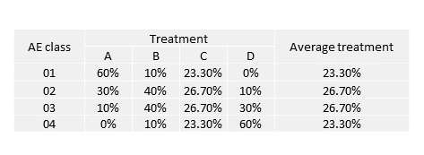
devtools::install_github("dnzmarcio/visae")patient_id <- 1:4000
group <- c(rep("A", 1000), rep("B", 1000), rep("C", 1000), rep("D", 1000))
ae_grade <- c(rep("AE class 01", 600), rep("AE class 02", 300),
rep("AE class 03", 100), rep("AE class 04", 0),
rep("AE class 01", 100), rep("AE class 02", 400),
rep("AE class 03", 400), rep("AE class 04", 100),
rep("AE class 01", 233), rep("AE class 02", 267),
rep("AE class 03", 267), rep("AE class 04", 233),
rep("AE class 01", 0), rep("AE class 02", 100),
rep("AE class 03", 300), rep("AE class 04", 600))
dt <- tibble(patient_id = patient_id, trt = group, ae_g = ae_grade)library(visae)
library(magrittr)
library(dplyr)
dt %>% run_ca(., group = trt,
id = patient_id,
ae_grade = ae_g)ca <- dt %>% ca_ae(., group = trt,
id = patient_id,
ae_class = ae_g,
contr_indicator = FALSE,
mass_indicator = TRUE,
contr_threshold = 0,
mass_threshold = 0)
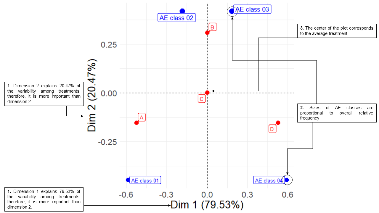
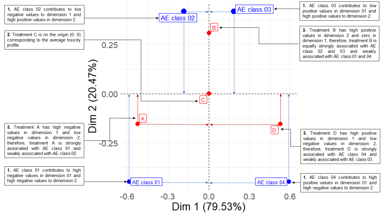
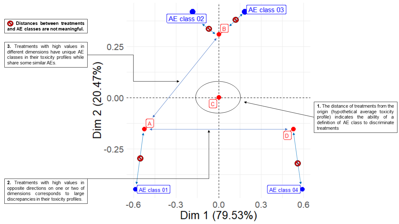
ca$asymmetric_plotInvestigators often interpret CA biplots erroneously assuming that the distance between AE classes dots and treatments dots is an indicative of association. See step by step to interpret biplots correctly are below:
These binaries (installable software) and packages are in development.
They may not be fully stable and should be used with caution. We make no claims about them.
Health stats visible at Monitor.