The hardware and bandwidth for this mirror is donated by dogado GmbH, the Webhosting and Full Service-Cloud Provider. Check out our Wordpress Tutorial.
If you wish to report a bug, or if you are interested in having us mirror your free-software or open-source project, please feel free to contact us at mirror[@]dogado.de.
The goal of spuriouscorrelations is to keep alive the amazing examples from Tyler Vigen. Unfortunately, as of 2023-10-09, the website is down as my students noticed. Therefore, I decided to use the snapshot from the Internet Wayback Machine to save the datasets from 2023-06-07.
You can install the development version of spuriouscorrelations like so:
remotes::install_github("pachadotdev/spuriouscorrelations")This is a basic example which shows you how to plot a spurious correlation:
library(dplyr)
#>
#> Attaching package: 'dplyr'
#> The following objects are masked from 'package:stats':
#>
#>     filter, lag
#> The following objects are masked from 'package:base':
#>
#>     intersect, setdiff, setequal, union
library(ggplot2)
library(spuriouscorrelations)

unique(spurious_correlations$var2_short)
#>  [1] US spending on science           Nicholas Cage
#>  [3] Cheese consumed                  Age of Miss America
#>  [5] Arcade revenue                   Space launches
#>  [7] Mozzarella cheese consumption    Kentucky marriages
#>  [9] US crude oil imports from Norway Chicken consumption
#> [11] Nuclear power plants             Japanese cars sold
#> [13] Spelling bee letters             Uranium stored
#> 14 Levels: Age of Miss America Arcade revenue ... US spending on science

nicholas_cage <- spurious_correlations %>%
  filter(var2_short == "Nicholas Cage")

ggplot(nicholas_cage) +
  geom_point(aes(x = var1_value, y = var2_value, color = year), size = 4) +
  theme_minimal() +
  labs(
    x = "Drownings by falling into a pool",
    y = "Nicholas Cage movies",
    title = "Drownings by Falling into a Pool vs Nicholas Cage Movies"
  )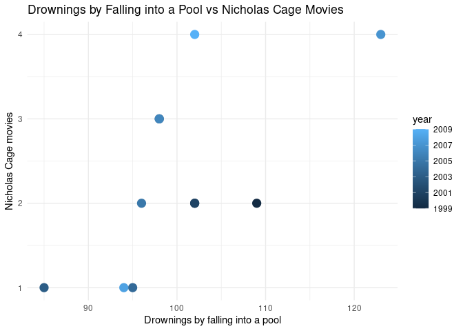
The correlation is:
cor(nicholas_cage$var1_value, nicholas_cage$var2_value)
#> [1] 0.6660043
Now let’s make it double-axis:
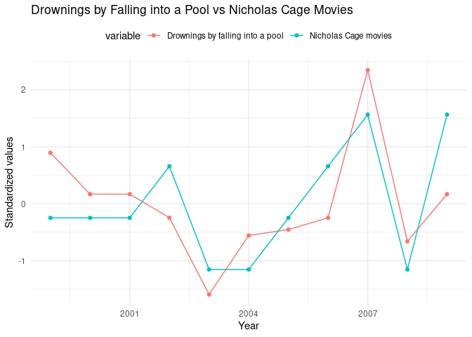
library(tidyr)

nicholas_cage_long <- nicholas_cage %>%
  select(year, var1_value, var2_value) %>%
  pivot_longer(
    cols = c(var1_value, var2_value),
    names_to = "variable",
    values_to = "value"
  ) %>%
  # standardize the values
  group_by(variable) %>%
  mutate(
    value = (value - mean(value)) / sd(value),
    variable = case_when(
      variable == "var1_value" ~ "Drownings by falling into a pool",
      variable == "var2_value" ~ "Nicholas Cage movies"
    )
  )

# make a double y axis plot with year on the x axis
ggplot(nicholas_cage_long, aes(
  x = year, y = value, color = variable,
  group = variable
)) +
  geom_line() +
  geom_point() +
  theme_minimal() +
  theme(legend.position = "top") +
  labs(
    x = "Year",
    y = "Standardized values",
    title = "Drownings by Falling into a Pool vs Nicholas Cage Movies"
  )
These binaries (installable software) and packages are in development.
They may not be fully stable and should be used with caution. We make no claims about them.
Health stats visible at Monitor.