The hardware and bandwidth for this mirror is donated by dogado GmbH, the Webhosting and Full Service-Cloud Provider. Check out our Wordpress Tutorial.
If you wish to report a bug, or if you are interested in having us mirror your free-software or open-source project, please feel free to contact us at mirror[@]dogado.de.
Read, manipulate and visualize ‘Pairwise mApping Format’ data in R
The package is not yet available on CRAN, but we will keep the master branch of this repository stable. You can install using devtools
#install.packages(devtools)
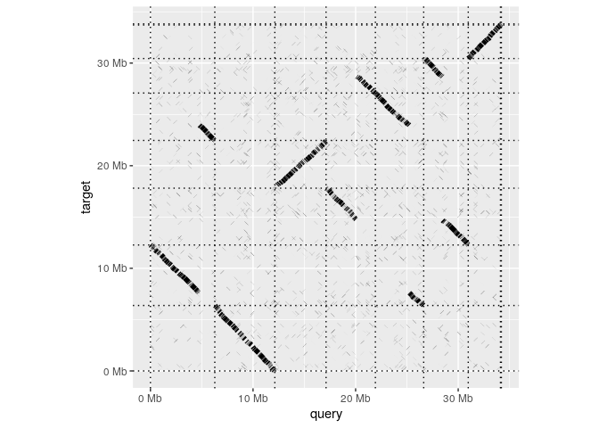
devtools::install_github("dwinter/pafr")Having installed the package, making a whole-genome dotplot is as
simple as reading in an alignment and calling dotplot:
library(pafr, quietly=TRUE)
test_alignment <- system.file("extdata", "fungi.paf", package="pafr")
ali <- read_paf(test_alignment)
dotplot(ali)
read_paf takes alignments in a .paf file and represents
them in table that behaves very much like a standard R
data.frame. The table has columns for each of the 12
standard columns in the .paf format as well columns for any any tags
represented in the file. Printing the tables shows a summary of the
contents and lists the the available tags.
ali
#> pafr object with 2501 alignments (36.5Mb)
#>  8 query seqs
#>  8 target seqs
#>  11 tags: NM, ms, AS, nn, tp, cm, s1, s2, dv, cg, zd
Because the table behaves as a data.frame, it integrates
with existing R functions. For example, We can find the mean length of
alignments in this file using the alen column.
mean(ali$alen)
#> [1] 14575.81
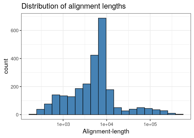
Likewise, we can produce a ggplot histogram of the distribution of alignment-lengths in the file.
ggplot(ali, aes(alen)) +
    geom_histogram(colour="black", fill="steelblue", bins=20) +
    theme_bw(base_size=16) +
    ggtitle("Distribution of alignment lengths") +
    scale_x_log10("Alignment-length")
If we decide we don’t like those shorter alignments, we can remove
them with subset or filter from dplyr.
long_ali <- subset(ali, alen > 1e4)
long_ali
#> pafr object with 448 alignments (27.2Mb)
#>  8 query seqs
#>  8 target seqs
#> 11 tags: NM, ms, AS, nn, tp, cm, s1, s2, dv, cg, zdIn addition to the dotplot demonstrated above, the package implements two other classes of genomic visualization
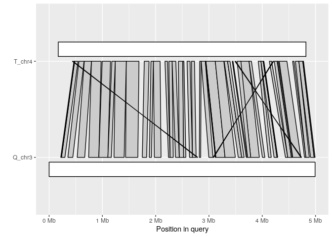
The synteny plot displays alignments between one query and one target sequence in a given paf file. Using the alignment above, we first filter short alignments then plot regions that align between query chromosome “Q_chr3” and target “T_chr4”:
long_ali <- subset(ali, alen > 1e4)
plot_synteny(long_ali, q_chrom="Q_chr3", t_chrom="T_chr4", centre=TRUE)
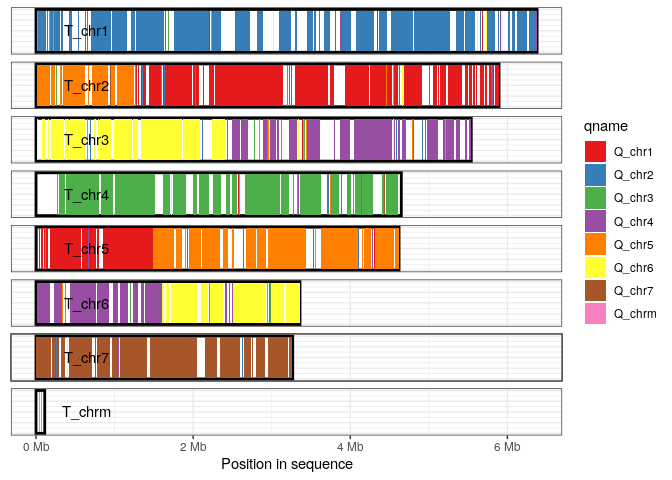
The coverage plot displays all sequences in either the query or target genome, shading those regions of each sequence that are covered by at least one alignment. This can be a useful in identifying how alternative genome assemblies differ from each other, or visualizing differences between related genomes.
In this example we visualize the sequences in the target genome, shading each aligned-region according to query-sequence aligning to that region.
plot_coverage(long_ali, fill='qname') +
   scale_fill_brewer(palette="Set1")
## Bugs/Issues
Please use the issue tracker on this repo to let us know about any bugs or issues that arise as you use this package.
These binaries (installable software) and packages are in development.
They may not be fully stable and should be used with caution. We make no claims about them.
Health stats visible at Monitor.