
The hardware and bandwidth for this mirror is donated by dogado GmbH, the Webhosting and Full Service-Cloud Provider. Check out our Wordpress Tutorial.
If you wish to report a bug, or if you are interested in having us mirror your free-software or open-source project, please feel free to contact us at mirror[@]dogado.de.
mapmixture is an R package and Shiny app that enables
users to visualise admixture as pie charts on a projected map. It also
allows users to visualise admixture as traditional structure barplots or
facet barplots.
mapmixture requires R (>= 4.2) to be installed on
your system. Click here to download
the latest version of R for Windows.
Install the latest stable release from CRAN:
install.packages("mapmixture")Install the latest development version from GitHub:
# install.packages("devtools")
devtools::install_github("Tom-Jenkins/mapmixture")mapmixture() # main function
structure_plot() # plot traditional structure or facet barplot
scatter_plot() # plot PCA or DAPC results
launch_mapmixture() # launch mapmixture Shiny appJenkins TL (2024). mapmixture: an R package and web app for spatial visualisation of admixture and population structure. Molecular Ecology Resources, 24: e13943. DOI: 10.1111/1755-0998.13943.
# Load package
library(mapmixture)

# Read in admixture file format 1
file <- system.file("extdata", "admixture1.csv", package = "mapmixture")
admixture1 <- read.csv(file)

# Read in coordinates file
file <- system.file("extdata", "coordinates.csv", package = "mapmixture")
coordinates <- read.csv(file)

# Run mapmixture
map1 <- mapmixture(admixture1, coordinates, crs = 3035)
# map1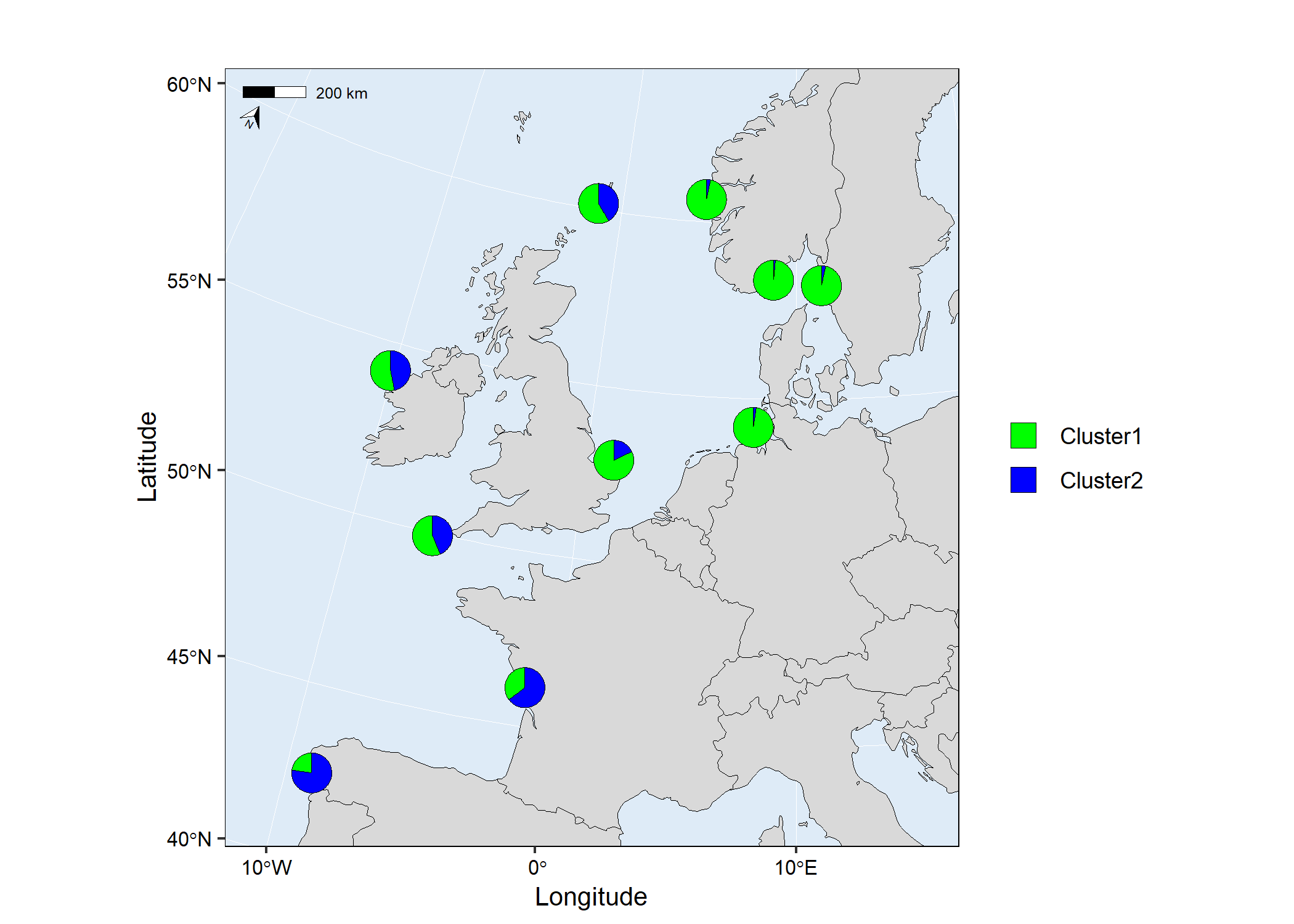
# Load packages
library(mapmixture)
library(rnaturalearthhires)

# Install rnaturalearthhires package using:
# install.packages("rnaturalearthhires", repos = "https://ropensci.r-universe.dev", type = "source")

# Read in admixture file format 1
file <- system.file("extdata", "admixture1.csv", package = "mapmixture")
admixture1 <- read.csv(file)

# Read in coordinates file
file <- system.file("extdata", "coordinates.csv", package = "mapmixture")
coordinates <- read.csv(file)

# Run mapmixture
map2 <- mapmixture(
  admixture_df = admixture1,
  coords_df = coordinates,
  cluster_cols = c("#f1a340","#998ec3"),
  cluster_names = c("Group A","Group B"),
  crs = 3035,
  basemap = rnaturalearthhires::countries10[, c("geometry")],
  boundary = c(xmin=-15, xmax=16, ymin=40, ymax=62),
  pie_size = 1,
  pie_border = 0.3,
  pie_border_col = "white",
  pie_opacity = 1,
  land_colour = "#d9d9d9",
  sea_colour = "#deebf7",
  expand = TRUE,
  arrow = TRUE,
  arrow_size = 1.5,
  arrow_position = "bl",
  scalebar = TRUE,
  scalebar_size = 1.5,
  scalebar_position = "tl",
  plot_title = "Admixture Map",
  plot_title_size = 12,
  axis_title_size = 10,
  axis_text_size = 8
)
# map2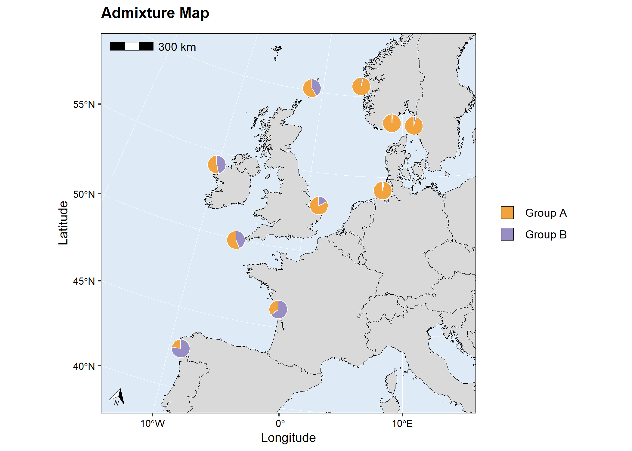
# Load package
library(mapmixture)

# Read in admixture file format 3
file <- system.file("extdata", "admixture3.csv", package = "mapmixture")
admixture3 <- read.csv(file)

# Read in coordinates file
file <- system.file("extdata", "coordinates.csv", package = "mapmixture")
coordinates <- read.csv(file)

# Run mapmixture
map3 <- mapmixture(admixture3, coordinates, crs = 3035)
# map3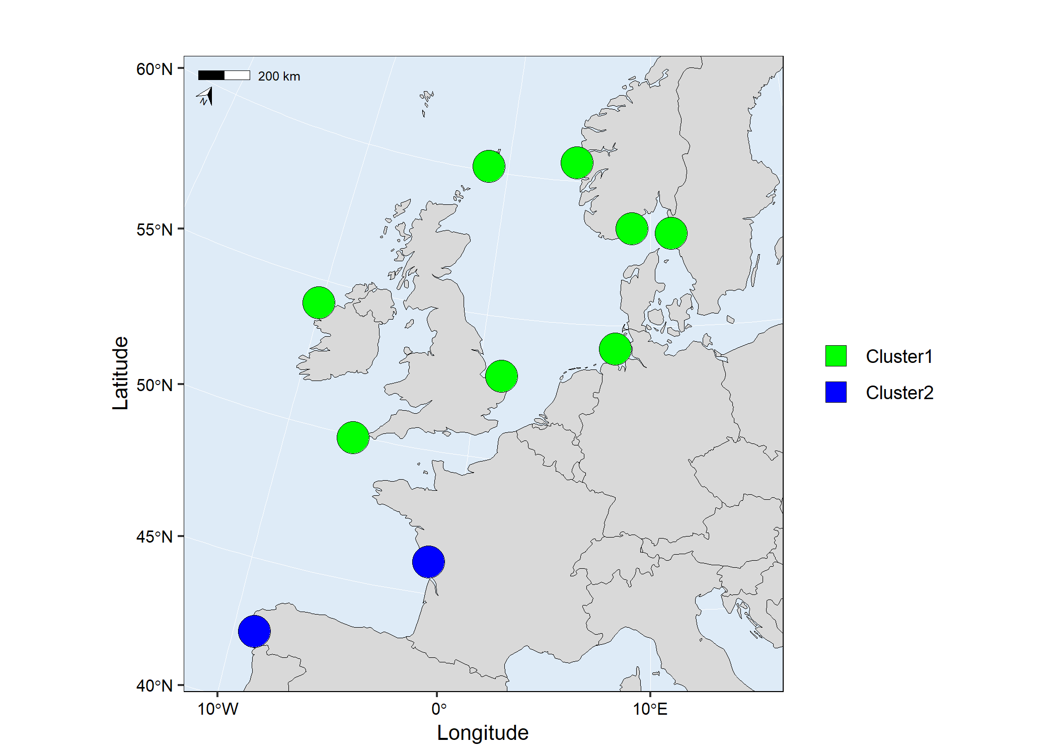
# Load packages
library(mapmixture)
library(ggplot2)

# Read in admixture file format 1
file <- system.file("extdata", "admixture1.csv", package = "mapmixture")
admixture1 <- read.csv(file)

# Read in coordinates file
file <- system.file("extdata", "coordinates.csv", package = "mapmixture")
coordinates <- read.csv(file)

# Run mapmixture
map4 <- mapmixture(
  admixture_df = admixture1,
  coords_df = coordinates,
  cluster_cols = c("#f1a340","#998ec3"),
  cluster_names = c("Ancestry 1","Ancestry 2"),
  crs = 4326,
  boundary = c(xmin=-15, xmax=16, ymin=40, ymax=62),
  pie_size = 1,
)+
  # Add additional label to the map
  annotate("label",
    x = -10,
    y = 46.5,
    label = "Atlantic Ocean",
    size = 3,
  )+
  # Add additional text to the map
  annotate("text",
    x = 2.5,
    y = 57,
    label = "North Sea",
    size = 3,
  )+
  # Adjust ggplot theme options
  theme(
    axis.title = element_text(size = 10),
    axis.text = element_text(size = 8),
  )+
  # Adjust the size of the legend keys
  guides(fill = guide_legend(override.aes = list(size = 5, alpha = 1)))
# map4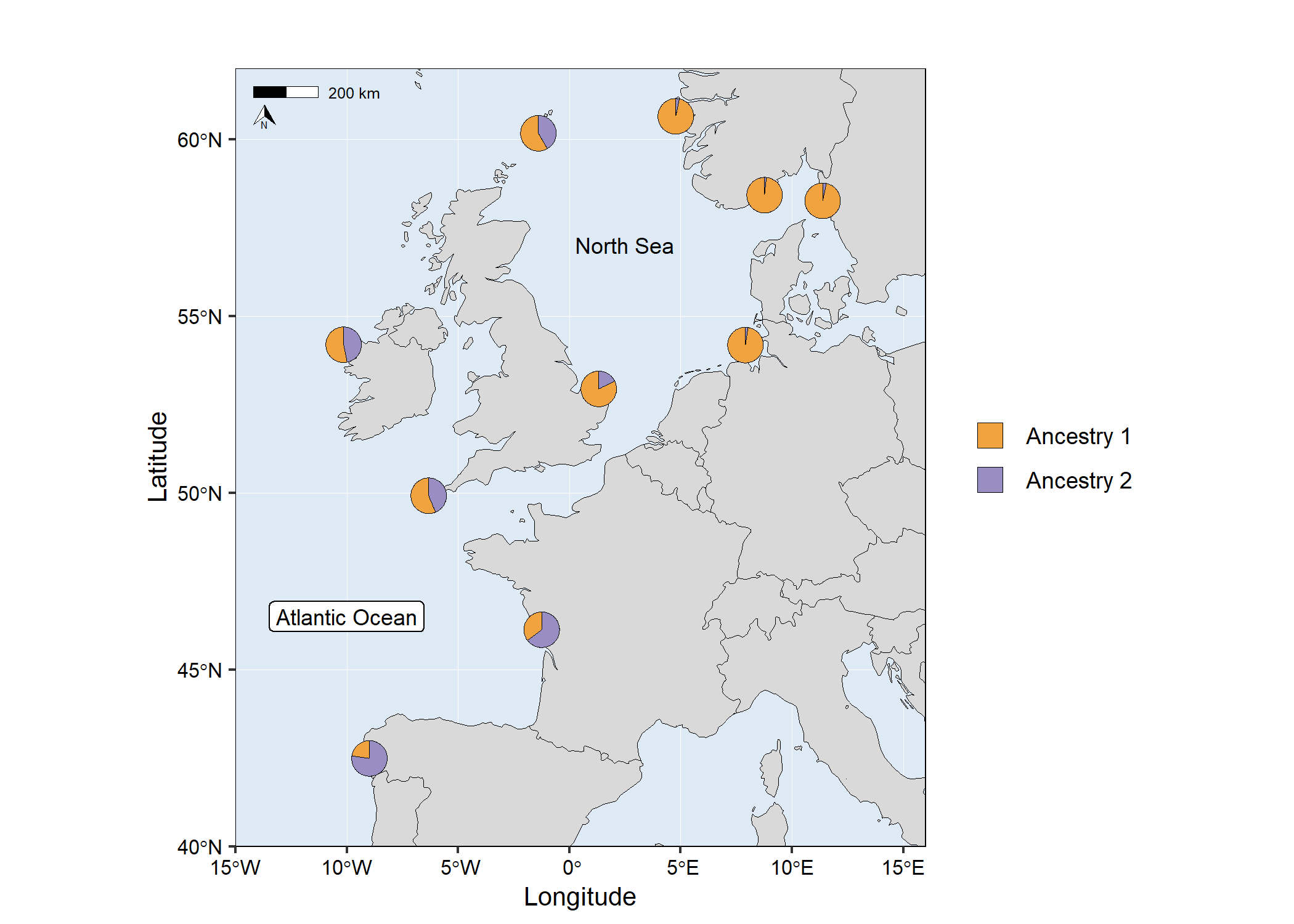
# Load packages
library(mapmixture)
library(ggplot2)
library(gridExtra)

# Read in admixture file format 1
file <- system.file("extdata", "admixture1.csv", package = "mapmixture")
admixture1 <- read.csv(file)

# Read in coordinates file
file <- system.file("extdata", "coordinates.csv", package = "mapmixture")
coordinates <- read.csv(file)

# Run mapmixture
map5 <- mapmixture(
  admixture_df = admixture1,
  coords_df = coordinates,
  cluster_cols = c("#f1a340","#998ec3"),
  cluster_names = c("Ancestry 1","Ancestry 2"),
  crs = 4326,
  boundary = c(xmin=-20, xmax=20, ymin=40, ymax=62),
  pie_size = 1.3,
)+
  # Adjust theme options
  theme(
    legend.position = "top",
    plot.margin = margin(l = 10, r = 10),
  )+
  # Adjust the size of the legend keys
  guides(fill = guide_legend(override.aes = list(size = 5, alpha = 1)))

# Traditional structure barplot
structure_barplot <- structure_plot(
  admixture_df = admixture1,
  type = "structure",
  cluster_cols = c("#f1a340","#998ec3"),
  site_dividers = TRUE,
  divider_width = 0.4,
  site_order = c(
    "Vigo","Ile de Re","Isles of Scilly","Mullet Peninsula",
    "Shetland","Cromer","Helgoland","Flodevigen","Lysekil","Bergen"
  ),
  labels = "site",
  flip_axis = FALSE,
  site_ticks_size = -0.05,
  site_labels_y = -0.35,
  site_labels_size = 2.2
)+
  # Adjust theme options
  theme(
    axis.title.y = element_text(size = 8, hjust = 1),
    axis.text.y = element_text(size = 5),
  )

# Arrange plots
# grid.arrange(map5, structure_barplot, nrow = 2, heights = c(4,1))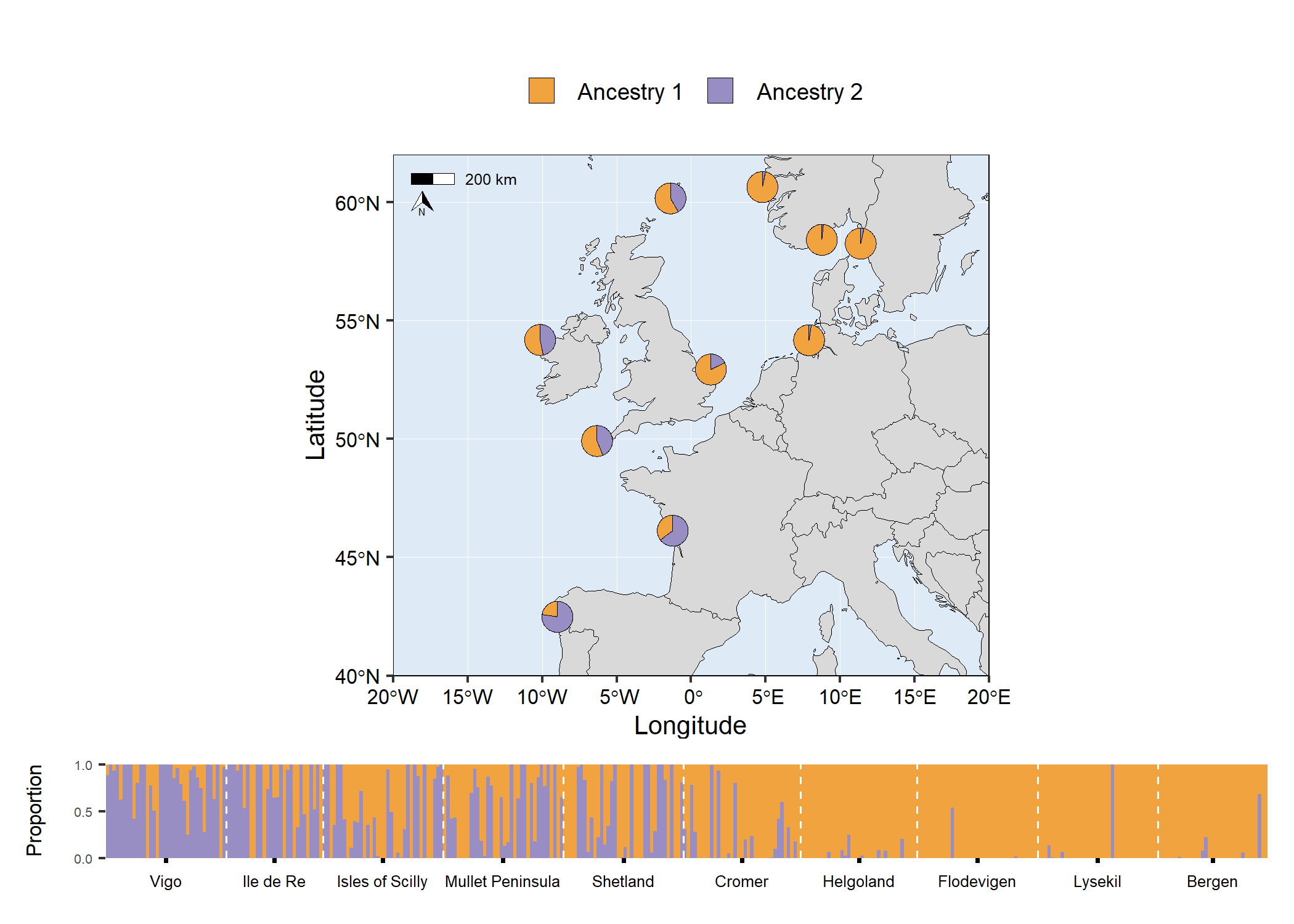
# Load packages
library(mapmixture)
library(ggplot2)
library(gridExtra)

# Read in admixture file format 1
file <- system.file("extdata", "admixture1.csv", package = "mapmixture")
admixture1 <- read.csv(file)

# Read in coordinates file
file <- system.file("extdata", "coordinates.csv", package = "mapmixture")
coordinates <- read.csv(file)

# Run mapmixture
map6 <- mapmixture(
  admixture_df = admixture1,
  coords_df = coordinates,
  cluster_cols = c("#f1a340","#998ec3"),
  cluster_names = c("Ancestry 1","Ancestry 2"),
  crs = 4326,
  boundary = c(xmin=-20, xmax=20, ymin=40, ymax=62),
  pie_size = 1.3,
)+
  # Adjust theme options
  theme(
    legend.position = "top",
    plot.margin = margin(l = 10, r = 10),
  )+
  # Adjust the size of the legend keys
  guides(fill = guide_legend(override.aes = list(size = 5, alpha = 1)))

# Facet structure barplot
facet_barplot <- structure_plot(admixture1,
  type = "facet",
  cluster_cols = c("#f1a340","#998ec3"),
  facet_col = 2,
  ylabel = "Admixture proportions",
)+
  theme(
    axis.title.y = element_text(size = 10),
    axis.text.y = element_text(size = 5),
    strip.text = element_text(size = 6, vjust = 1, margin = margin(t=1.5, r=0, b=1.5, l=0)),
  )

# Arrange plots
# grid.arrange(map6, facet_barplot, ncol = 2, widths = c(3,2))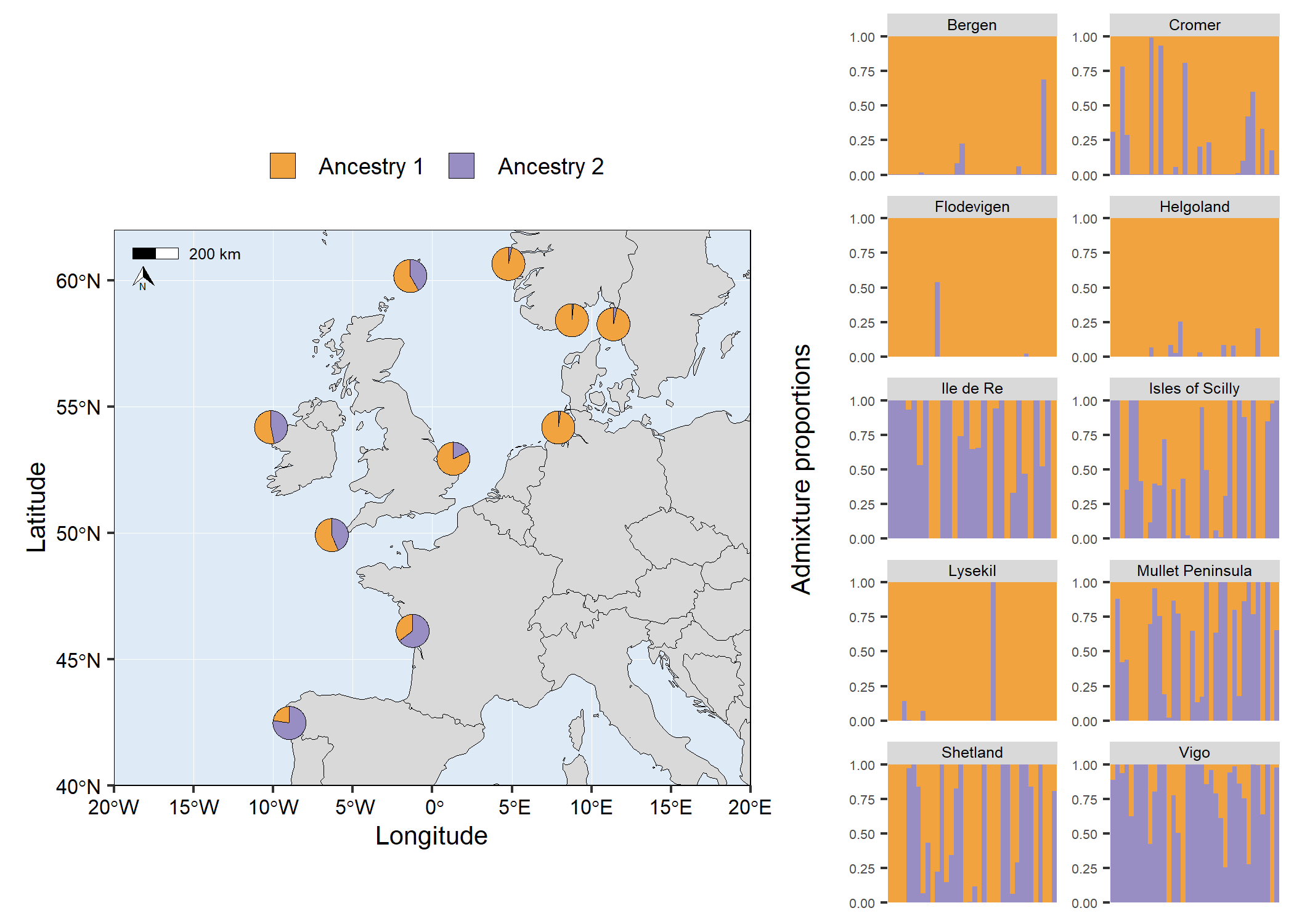
The raster (TIFF) used in the example below was downloaded from
Natural Earth here.
You need to install the terra package to use this
feature. Currently, the basemap argument accepts a
SpatRaster or a sf object.
# Load packages
library(mapmixture)
library(terra)

# Create SpatRaster object
earth <- terra::rast("../NE1_50M_SR_W/NE1_50M_SR_W.tif")

# Read in admixture file format 1
file <- system.file("extdata", "admixture1.csv", package = "mapmixture")
admixture1 <- read.csv(file)

# Read in coordinates file
file <- system.file("extdata", "coordinates.csv", package = "mapmixture")
coordinates <- read.csv(file)

# Run mapmixture
map7 <- mapmixture(admixture1, coordinates, crs = 3035, basemap = earth)
# map7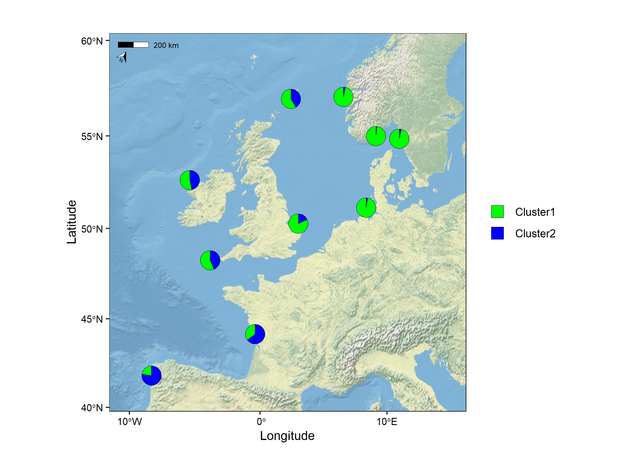
The vector data (shapefile) used in the example below was downloaded from the Natural England Open Data Geoportal here.
# Load packages
library(mapmixture)
library(rnaturalearthhires)
library(ggplot2)
library(dplyr)
library(sf)

# Read in admixture file format 1
file <- system.file("extdata", "admixture1.csv", package = "mapmixture")
admixture1 <- read.csv(file)

# Read in coordinates file
file <- system.file("extdata", "coordinates.csv", package = "mapmixture")
coordinates <- read.csv(file)

# Parameters
crs <- 3035
boundary <- c(xmin=-11, xmax=13, ymin=50, ymax=60) |> transform_bbox(bbox = _, crs)

# Read in world countries from Natural Earth and transform to CRS
world <- rnaturalearthhires::countries10[, c("geometry")]
world <- st_transform(world, crs = crs)

# Read in Marine Conservation Zones shapefile
# Extract polygons for Western Channel, Offshore Brighton and Swallow Sand
# Transform to CRS
mczs <- st_read("../Marine_Conservation_Zones_England/Marine_Conservation_Zones___Natural_England_and_JNCC.shp", quiet = TRUE) |>
  dplyr::filter(.data = _, MCZ_NAME %in% c("Western Channel", "Offshore Brighton", "Swallow Sand")) |>
  st_transform(x = _, crs = crs)

# Run mapmixture helper functions to prepare admixture and coordinates data
admixture_df <- standardise_data(admixture1, type = "admixture") |> transform_admix_data(data = _)
coords_df <- standardise_data(coordinates, type = "coordinates")
admix_coords <- merge_coords_data(coords_df, admixture_df) |> transform_df_coords(df = _, crs = crs)

# Plot map and add pie charts
map8 <- ggplot()+
  geom_sf(data = world, colour = "black", fill = "#d9d9d9", size = 0.1)+
  geom_sf(data = mczs, aes(fill = "MCZs"), linewidth = 0.3)+
  scale_fill_manual(values = c("yellow"))+
  coord_sf(
    xlim = c(boundary[["xmin"]], boundary[["xmax"]]),
    ylim = c(boundary[["ymin"]], boundary[["ymax"]])
  )+
  add_pie_charts(admix_coords,
    admix_columns = 4:ncol(admix_coords),
    lat_column = "lat",
    lon_column = "lon",
    pie_colours = c("green","blue"),
    border = 0.3,
    opacity = 1,
    pie_size = 0.8
  )+
  theme(
    legend.title = element_blank(),
  )
# map8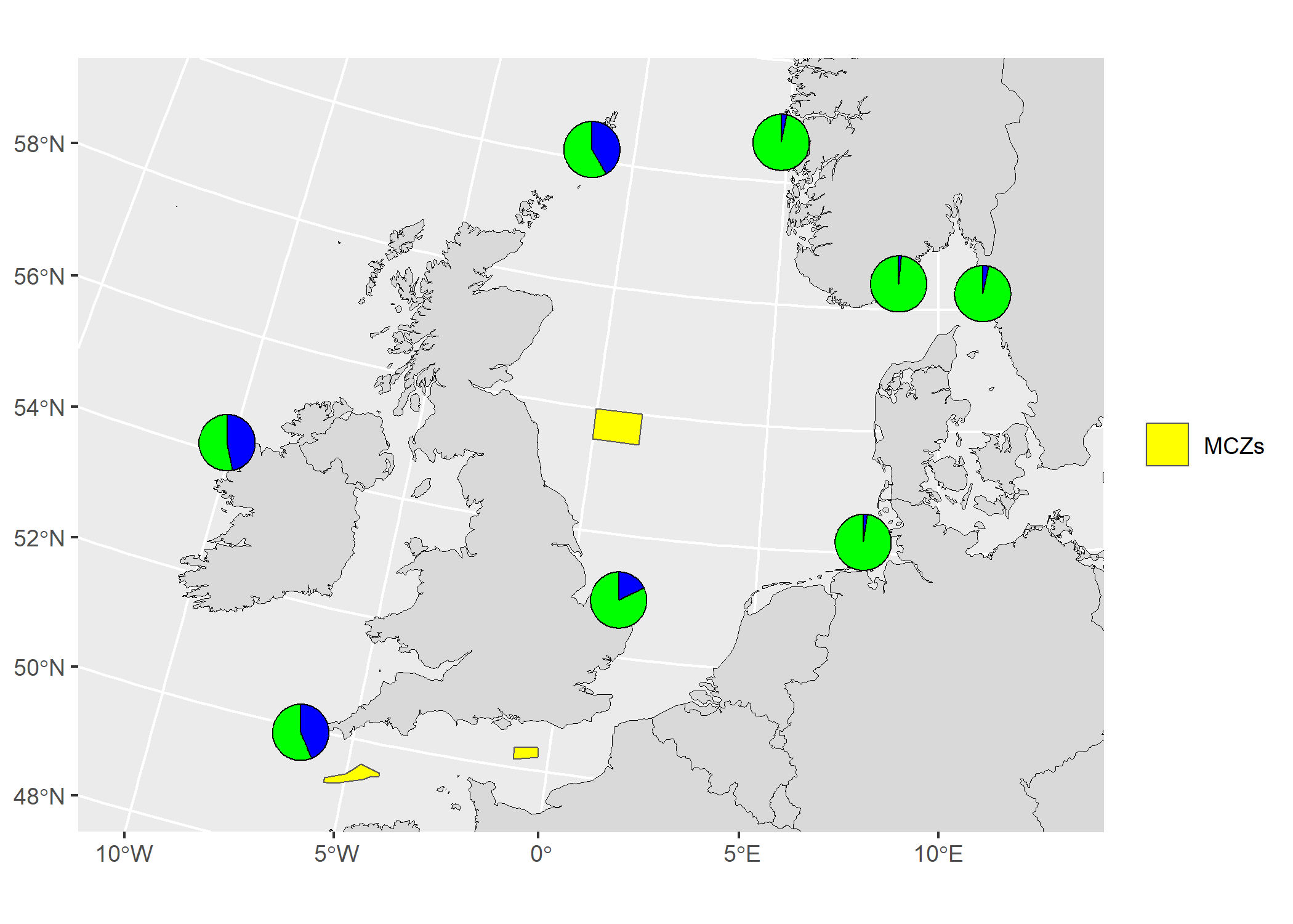
# Load packages
library(mapmixture)
library(ggplot2)
library(adegenet)
library(RColorBrewer)
library(gridExtra)

# Load example genotypes
data("dapcIllus")
geno = dapcIllus$a

# Change population labels
popNames(geno) = c("Pop1","Pop2","Pop3","Pop4","Pop5","Pop6")

# Region names
region_names <- rep(c("Region1", "Region2"), each = 300)

# Define colour palette
cols = brewer.pal(nPop(geno), "RdYlBu")

# Perform PCA
pca1 = dudi.pca(geno, scannf = FALSE, nf = 3)

# Percent of genetic variance explained by each axis
percent = round(pca1$eig/sum(pca1$eig)*100, digits = 1)

# Scatter plot with centroids and segments
scatter1 <- scatter_plot(
  dataframe = pca1$li,
  group_ids = geno$pop,
  type = "points",
  axes = c(1,2),
  percent = percent,
  colours = cols,
  point_size = 2,
  point_type = 21,
  centroid_size = 2,
  stroke = 0.1,
  plot_title = "PCA coloured by group_ids"
)+
  theme(
    legend.position = "none",
    axis.title = element_text(size = 8),
    axis.text = element_text(size = 6),
    plot.title = element_text(size = 10),
  )

# Same as scatter1 but no segments and axis 1 and 3 are shown
scatter2 <- scatter_plot(
  dataframe = pca1$li,
  group_ids = geno$pop,
  type = "points",
  axes = c(1,3),
  percent = percent,
  colours = cols,
  point_size = 2,
  point_type = 21,
  centroids = TRUE,
  centroid_size = 2,
  segments = FALSE,
  stroke = 0.1,
  plot_title = "PCA no segments and axis 1 and 3 shown"
)+
  theme(
    legend.position = "none",
    axis.title = element_text(size = 8),
    axis.text = element_text(size = 6),
    plot.title = element_text(size = 10),
  )

# Same as scatter1 but coloured by region
scatter3 <- scatter_plot(
  dataframe = pca1$li,
  group_ids = geno$pop,
  other_group = region_names,
  type = "points",
  axes = c(1,2),
  percent = percent,
  colours = cols,
  point_size = 2,
  point_type = 21,
  centroid_size = 2,
  stroke = 0.1,
  plot_title = "PCA coloured by other_group"
)+
  theme(
    legend.position = "none",
    axis.title = element_text(size = 8),
    axis.text = element_text(size = 6),
    plot.title = element_text(size = 10),
  )

# Scatter plot with labels instead of points
scatter4 <- scatter_plot(
  dataframe = pca1$li,
  group_ids = geno$pop,
  type = "labels",
  labels = rownames(pca1$li),
  colours = cols,
  size = 2,
  label.size = 0.10,
  label.padding = unit(0.10, "lines"),
  plot_title = "PCA using labels instead of points"
)+
  theme(
    legend.position = "none",
    axis.title = element_text(size = 8),
    axis.text = element_text(size = 6),
    plot.title = element_text(size = 10),
  )

# Arrange plots
# grid.arrange(scatter1, scatter2, scatter3, scatter4)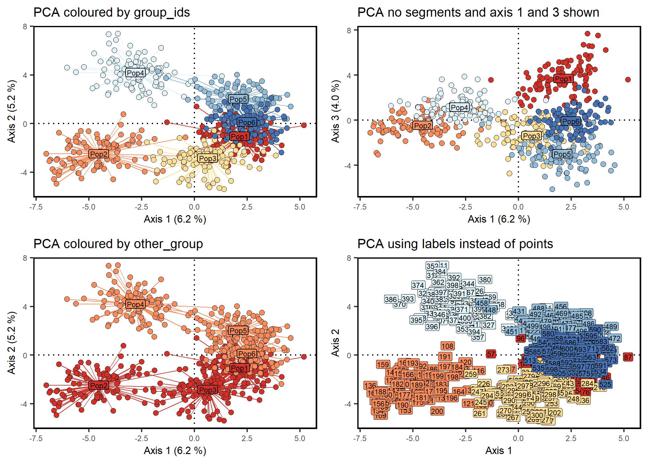
# Load package
library(mapmixture)

# Launch Shiny app
launch_mapmixture()

# Tested with the following package versions:
# shiny v1.8.0 (important)
# shinyFeedback v0.4.0
# shinyjs v2.1.0
# shinyWidgets 0.8.4
# bslib 0.7.0
# colourpicker 1.3.0
# htmltools v0.5.8.1
# waiter 0.2.5https://tomjenkins.shinyapps.io/mapmixture/
# Load package
library(mapmixture)

# Admixture Format 1
file <- system.file("extdata", "admixture1.csv", package = "mapmixture")
admixture1 <- read.csv(file)
head(admixture1)
#>     Site   Ind Cluster1 Cluster2
#> 1 Bergen Ber01   0.9999    1e-04
#> 2 Bergen Ber02   0.9999    1e-04
#> 3 Bergen Ber03   0.9999    1e-04
#> 4 Bergen Ber04   0.9999    1e-04
#> 5 Bergen Ber05   0.9999    1e-04
#> 6 Bergen Ber06   0.9999    1e-04

# Admixture Format 2
file <- system.file("extdata", "admixture2.csv", package = "mapmixture")
admixture2 <- read.csv(file)
admixture2
#>                Site              Ind  Cluster1   Cluster2
#> 1            Bergen           Bergen 0.9675212 0.03247879
#> 2            Cromer           Cromer 0.8217114 0.17828857
#> 3        Flodevigen       Flodevigen 0.9843806 0.01561944
#> 4         Helgoland        Helgoland 0.9761543 0.02384571
#> 5         Ile de Re        Ile de Re 0.3529000 0.64710000
#> 6   Isles of Scilly  Isles of Scilly 0.5632444 0.43675556
#> 7           Lysekil          Lysekil 0.9661722 0.03382778
#> 8  Mullet Peninsula Mullet Peninsula 0.5316833 0.46831667
#> 9          Shetland         Shetland 0.5838028 0.41619722
#> 10             Vigo             Vigo 0.2268444 0.77315556

# Admixture Format 3
file <- system.file("extdata", "admixture3.csv", package = "mapmixture")
admixture3 <- read.csv(file)
admixture3
#>                Site              Ind Cluster1 Cluster2
#> 1            Bergen           Bergen        1        0
#> 2            Cromer           Cromer        1        0
#> 3        Flodevigen       Flodevigen        1        0
#> 4         Helgoland        Helgoland        1        0
#> 5         Ile de Re        Ile de Re        0        1
#> 6   Isles of Scilly  Isles of Scilly        1        0
#> 7           Lysekil          Lysekil        1        0
#> 8  Mullet Peninsula Mullet Peninsula        1        0
#> 9          Shetland         Shetland        1        0
#> 10             Vigo             Vigo        0        1

# Coordinates
file <- system.file("extdata", "coordinates.csv", package = "mapmixture")
coordinates <- read.csv(file)
coordinates
#>                Site   Lat    Lon
#> 1            Bergen 60.65   4.77
#> 2            Cromer 52.94   1.31
#> 3        Flodevigen 58.42   8.76
#> 4         Helgoland 54.18   7.90
#> 5         Ile de Re 46.13  -1.25
#> 6   Isles of Scilly 49.92  -6.33
#> 7           Lysekil 58.26  11.37
#> 8  Mullet Peninsula 54.19 -10.15
#> 9          Shetland 60.17  -1.40
#> 10 Vigo 42.49 -8.99These binaries (installable software) and packages are in development.
They may not be fully stable and should be used with caution. We make no claims about them.
Health stats visible at Monitor.