
The hardware and bandwidth for this mirror is donated by dogado GmbH, the Webhosting and Full Service-Cloud Provider. Check out our Wordpress Tutorial.
If you wish to report a bug, or if you are interested in having us mirror your free-software or open-source project, please feel free to contact us at mirror[@]dogado.de.
The goal of gsloid is to make available raw data for sea level curves
and 18O curves for the Holocene and most
of the Pleistocene.
You can install gsloid from CRAN with:
inistall.pacakges("gsloid")Or you can install the development version of gsloid from github with:
# install.packages("devtools")
devtools::install_github("benmarwick/gsloid")This package includes commonly used datasets in palaeoecology and archaeology:
There are many possible sources for these kinds of data, this package includes data from:
| Dataset | Source |
|---|---|
| lisiecki2005 | Lisiecki, L.E. and M.E. Raymo. 2005. A Pliocene-Pleistocene stack of 57 globally distributed benthic D18O records. Paleoceanography, Vol. 20, PA1003, https://doi.org/10.1029/2004PA001071 |
| spratt2016 | Spratt, Rachel M. and Lorraine E. Lisiecki 2016. A Late Pleistocene sea level stack. Climate of the Past. Vol. 12, 1079-1092, https://doi.org/10.5194/cp-12-1-2016 |
You must cite those sources in the table above if you use the data in this package.
Here’s the structure of the main data sets:
library(gsloid)
str(lisiecki2005)
#> 'data.frame':    2115 obs. of  3 variables:
#>  $ Time : num  0 1 2 3 4 5 6 7 8 9 ...
#>  $ d18O : num  3.23 3.23 3.18 3.29 3.3 3.26 3.33 3.37 3.42 3.38 ...
#> $ Error: num 0.03 0.04 0.03 0.03 0.03 0.03 0.04 0.04 0.03 0.04 ...str(spratt2016)
#> 'data.frame': 799 obs. of 9 variables:
#> $ age_calkaBP : num 0 1 2 3 4 5 6 7 8 9 ...
#> $ SeaLev_shortPC1 : num 8.49 7.63 4.01 4.35 3.13 ...
#> $ SeaLev_shortPC1_err_sig: num 5.23 4.87 4.83 4.72 4.74 4.57 5.04 5.9 6.79 8.3 ...
#> $ SeaLev_shortPC1_err_lo : num -1.72 -2.9 -4.51 -6.93 -10.43 ...
#> $ SeaLev_shortPC1_err_up : num 17.93 16.39 13.59 12.08 8.41 ...
#> $ SeaLev_longPC1 : num 8.96 7.72 5.96 3.54 1.88 0 -2 -5.38 -7.12 -11.6 ...
#> $ SeaLev_longPC1_err_sig : num 5.72 5.13 4.69 4.42 4.39 ...
#> $ SeaLev_longPC1_err_lo : num -1.21 -2.77 -5.01 -7.28 -10.54 ...
#> $ SeaLev_longPC1_err_up : num 20.38 17.1 14.21 10.9 7.63 ...str(LR04_MISboundaries)
#> 'data.frame': 232 obs. of 7 variables:
#> $ MIS_Boundary : chr "1/2" "2/3" "3/4" "4/5" ...
#> $ start_MIS : chr "1" "2" "3" "4" ...
#> $ end_MIS : chr "2" "3" "4" "5" ...
#> $ label_MIS : chr "1" "2" "3" "4" ...
#> $ LR04_Age_ka_start: num 14 29 57 71 82 87 96 109 123 130 ...
#> $ LR04_Age_ka_end : num 0 14 29 57 71 82 87 96 109 123 ...
#> $ LR04_Age_ka_mid : num 7 21.5 43 64 76.5 ...Detailed descriptions of the variables are avaliable in the data
documentation, run ?lisiecki2005, ?spratt2016
and ?LR04_MISboundaries for more information.
Atlhough these data are suitable for many kinds of analyses, the primary reason that I made this package is so I can easily make my own plots of these data. Here’s how I typically start with plotting the oxygen isotope data. I have set limits on the x-axis so it only shows 0-250 ka because that’s what I’m interested in:
library(ggplot2)


ggplot(lisiecki2005,
       aes(Time,
           d18O)) +
  geom_line() +
  scale_x_continuous(limits = c(0, 250),
                     name = "x 1000 years ago") +
  scale_y_reverse(name = bquote(delta^18*O)) +
  theme_bw()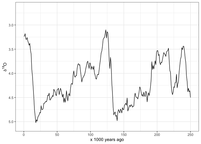
And here’s how I start to plot the sea level data:
ggplot(spratt2016,
       aes(age_calkaBP,
           SeaLev_shortPC1)) +
  geom_line() +
  scale_x_continuous(limits = c(0, 250),
                     name = "x 1000 years ago") +
  scale_y_continuous(name = "Sea Level, meters above present day") +
  theme_bw()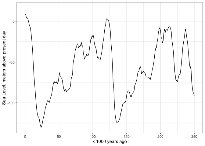
Often we want to see the Marine istope stages on these plots also.
This package includes the dataset LR04_MISboundaries of
start and end dates for each stage, so we can draw these stages easily.
I obtained these data from Lorraine Lisiecki’s web page: http://lorraine-lisiecki.com/LR04_MISboundaries.txt
Some care is required to get the MIS numbers positions in
easy-to-read locations. Here I use rep() and
seq() to help position the numbers.
# subset the MIS data for the last 250 ka years
mis_last_250ka <- LR04_MISboundaries[LR04_MISboundaries$LR04_Age_ka_start <= 250, ]

# plot the oxygen istope data line on top of the MIS lines
ggplot() +
  geom_vline(data = mis_last_250ka,          # add MIS lines
             aes(xintercept = LR04_Age_ka_start),
             colour = "blue") +
  annotate("text",
           label = mis_last_250ka$label_MIS,
           x = mis_last_250ka$LR04_Age_ka_mid,
           y = c(rep(3.0, 4),
                 seq(3.2, 2.7, length.out = 6),
                 rep(3.0, 2)),
           size = 3) +
  geom_line(data = lisiecki2005,                # add d18O line
            aes(Time,
                d18O)) +
  scale_x_continuous(limits = c(0, 250),
                     name = "x 1000 years ago") +
  scale_y_reverse(name = bquote(delta^18*O)) +
  theme_bw()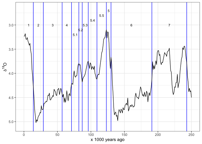
Sometimes we prefer to indicate the MIS by horizontal lines. Once again we have to carefully place the line segments and labels so they are clear to read:
ggplot() +
  geom_segment(data = mis_last_250ka, # add MIS lines
               aes(x =    LR04_Age_ka_end,
                   xend = LR04_Age_ka_start,
                   y =    seq(3, 2.5, length.out = nrow(mis_last_250ka)),
                   yend = seq(3, 2.5, length.out = nrow(mis_last_250ka))),
               colour = "blue",
               size = 1) +
  annotate("text",
           label = mis_last_250ka$label_MIS,
           x =     mis_last_250ka$LR04_Age_ka_mid,
           y = c(seq(2.9, 2.7, length.out = 4),
                 seq(3.1, 2.8, length.out = 5),
                 seq(2.4, 2.3, length.out = 3)),
           size = 3) +
  geom_line(data = lisiecki2005,                # add d18O line
            aes(Time,
                d18O)) +
  scale_x_continuous(limits = c(0, 250),
                     name = "x 1000 years ago") +
  scale_y_reverse(name = bquote(delta^18*O)) +
  theme_bw()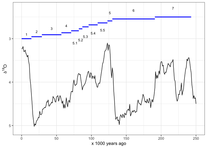
And sometimes we might want shaded rectangles to indicate the MIS:
ggplot() +
  annotate("rect",
           xmin = mis_last_250ka$LR04_Age_ka_end,
           xmax = mis_last_250ka$LR04_Age_ka_start,
           ymin = -Inf,
           ymax = Inf,
        alpha = .2,
        fill = rep(c("grey70", "white"),
                   nrow(mis_last_250ka)/2)) +
  annotate("text",
           label = mis_last_250ka$label_MIS,
           x =     mis_last_250ka$LR04_Age_ka_mid,
           y = c(rep(3, 4),
                 seq(3.1, 2.8, length.out = 5),
                 rep(3, 3)),
           size = 3) +
  geom_line(data = lisiecki2005,                # add d18O line
            aes(Time,
                d18O)) +
  scale_x_continuous(limits = c(0, 250),
                     name = "x 1000 years ago") +
  scale_y_reverse(name = bquote(delta^18*O)) +
  theme_bw()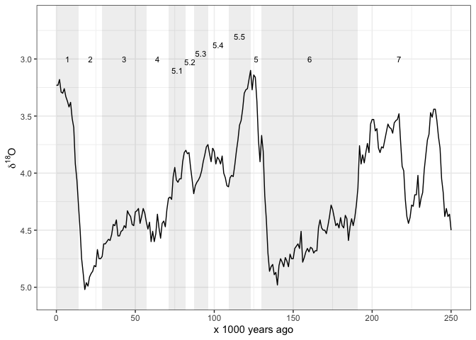
Maybe we want the MIS regions by themselves so we can plot some other
time series besides the ones includes here. We need to adjust the
y values in the annotate() function to ensure
that the MIS labels show in a readble way. Here I show an imaginary
variable that might have a maximum value of about 10. So I adjust the
y values in the annotate() function to
position the MIS labels just below 10 on the y axis.
ggplot() +
  annotate("rect",
           xmin = mis_last_250ka$LR04_Age_ka_end ,
           xmax = mis_last_250ka$LR04_Age_ka_start,
           ymin = -Inf,
           ymax = Inf,
        alpha = .2,
        fill = rep(c("grey70", "white"),
                   nrow(mis_last_250ka)/2)) +
  annotate("text",
           label = mis_last_250ka$label_MIS,
           x =     mis_last_250ka$LR04_Age_ka_mid,
           y = c(rep(9, 4),
                 seq(8.1, 9.9, length.out = 5),
                 rep(9, 3)),
           size = 3) +
  # add in other geoms here...
  scale_x_continuous(limits = c(0, 250),
                     name = "x 1000 years ago") +
  scale_y_continuous(limits = c(0, 10),
                  name = "Some other variable (units)") +
  theme_bw()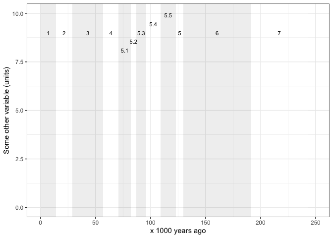
Please note that this project is released with a Contributor Code of Conduct. By participating in this project you agree to abide by its terms.
These binaries (installable software) and packages are in development.
They may not be fully stable and should be used with caution. We make no claims about them.
Health stats visible at Monitor.