The hardware and bandwidth for this mirror is donated by dogado GmbH, the Webhosting and Full Service-Cloud Provider. Check out our Wordpress Tutorial.
If you wish to report a bug, or if you are interested in having us mirror your free-software or open-source project, please feel free to contact us at mirror[@]dogado.de.
![]()
Add arrows, labels, and change annotations to ggplot2 business charts in one line of code.
| You want to… | Use |
|---|---|
| Point at a data point with an arrow and label | annotate_callout(data, where = year == 2024, label = "Peak") |
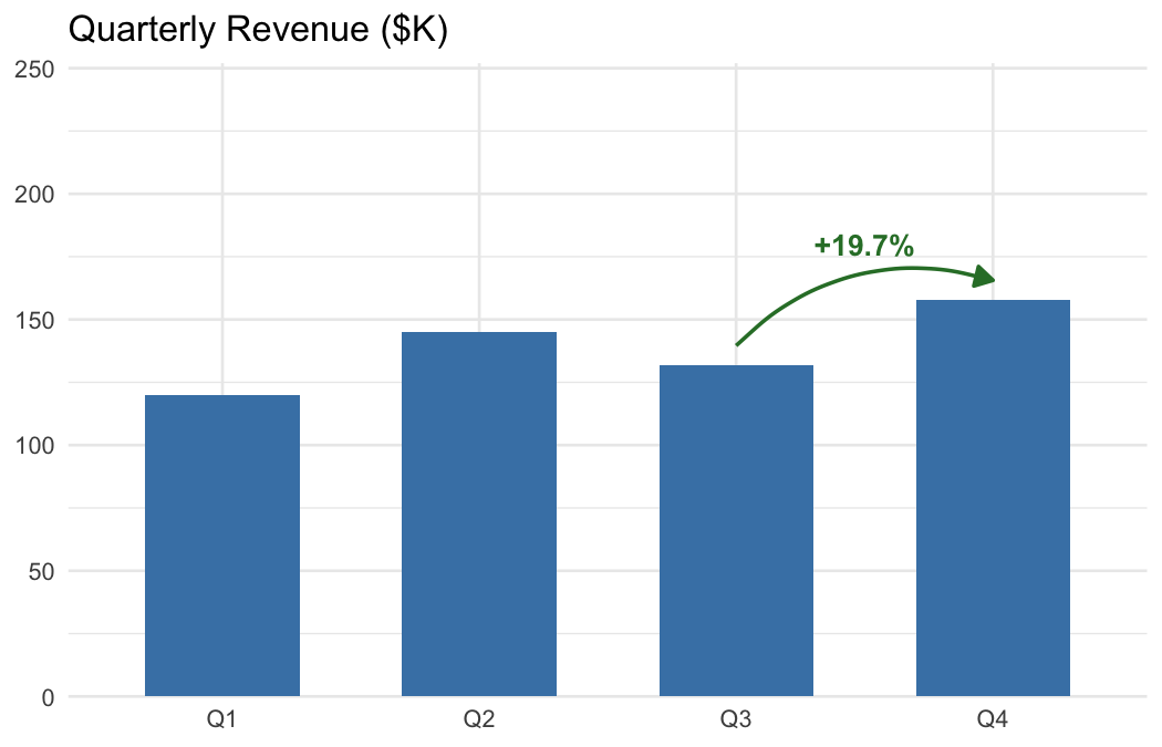
| Show percent change between two rows | annotate_change(data, from = ..., to = ..., value = sales) |
| Show absolute difference | annotate_change(..., format = "absolute") |
| Show change in percentage points | annotate_change(..., format = "points") |
| Use custom colors | annotate_change(..., colors = c(up = "#1B9E77", down = "#D95F02", flat = "#999")) |
Without ggmemo, annotating a ggplot2 chart means hardcoding coordinates, computing deltas, formatting labels, and choosing colors — roughly 10 lines of manual work per annotation. ggmemo replaces that with a single function call.
# install.packages("pak")
pak::pak("lindsay-lintelman/ggmemo")Charts below are rendered at 7 × 4.5 in, 150 dpi.
Point at a specific data row with an arrow and label:
library(ggplot2)
library(ggmemo)

# fig.width = 7, fig.height = 4.5, dpi = 150
econ <- economics
econ$unemp_rate <- econ$unemploy / econ$pop * 100

ggplot(econ, aes(x = date, y = unemp_rate)) +
  geom_line() +
  annotate_callout(
    econ,
    where = date == as.Date("1982-12-01"),
    label = "Volcker recession",
    position = "top-right",
    nudge = c(-1500, 0.5),
    arrow = NULL,
    point.padding = 2,
    alpha = .7
  ) +
  annotate_callout(
    econ,
    where = date == as.Date("2009-10-01"),
    label = "'08 Financial Crisis",
    position = "bottom-right",
    nudge = c(-2500, 0.5),
    arrow = NULL,
    point.padding = 2,
    alpha = .7
  ) +
  annotate_change(
    econ,
    from = date == as.Date("1982-12-01"),
    to = date == as.Date("2009-10-01"),
    value = unemp_rate,
    arrow_size = .08,
    arrow_type = "closed",
    curvature = -.3,
    format = "points"
  ) +
  scale_y_continuous(expand = expansion(mult = c(0.05, 0.15))) +
  labs(title = "U.S. Unemployment as Share of Population (%)",
       x = NULL, y = NULL) +
  theme(plot.margin = margin(10, 60, 10, 10))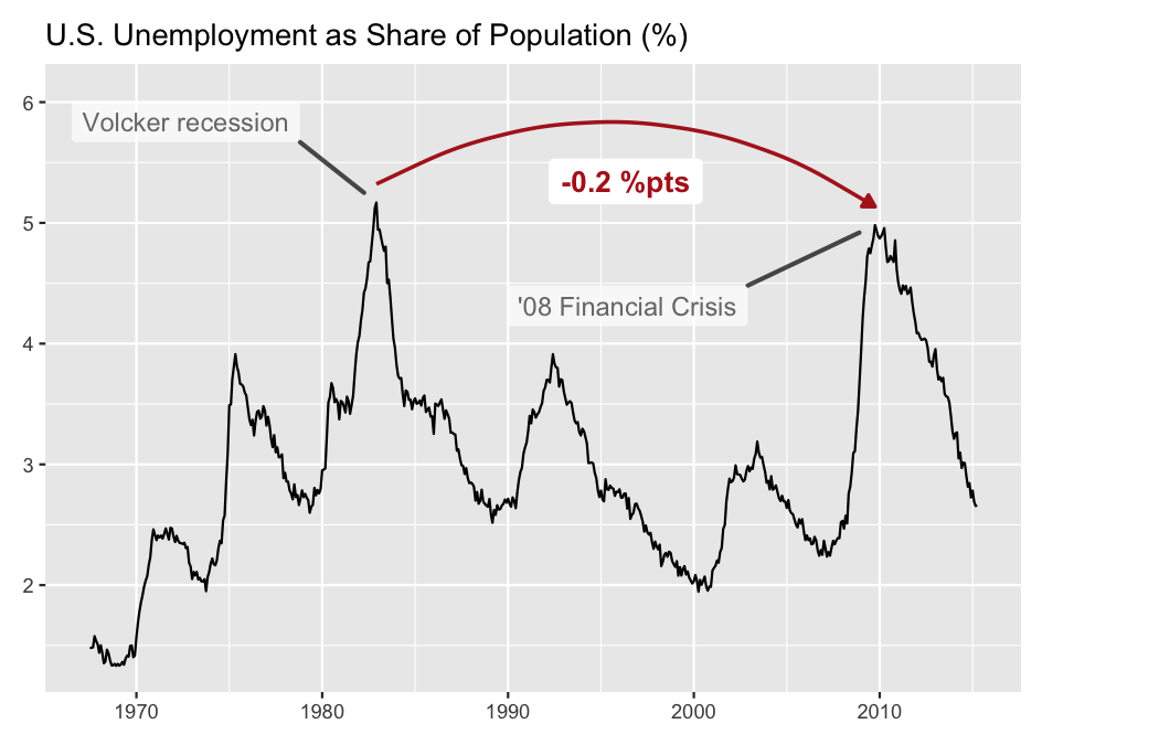
Show the delta between two data points with a color-coded arrow:
# fig.width = 7, fig.height = 4.5, dpi = 150
econ <- economics
econ$unemp_rate <- econ$unemploy / econ$pop * 100

ggplot(econ, aes(x = date, y = unemp_rate)) +
  geom_line(colour = "grey40") +
  annotate_change(
    econ,
    from = date == as.Date("2009-10-01"),
    to = date == as.Date("2015-03-01"),
    value = unemp_rate,
    arrow_pad = 0.05,
    curvature = -.35,
    arrow_size = 0.08,
    x = as.Date("2015-01-01"),
    y = 4.95,
    fill = NA
  ) +
  labs(title = "U.S. Unemployment as Share of Population (%)",
       x = NULL, y = NULL) +
  theme_minimal()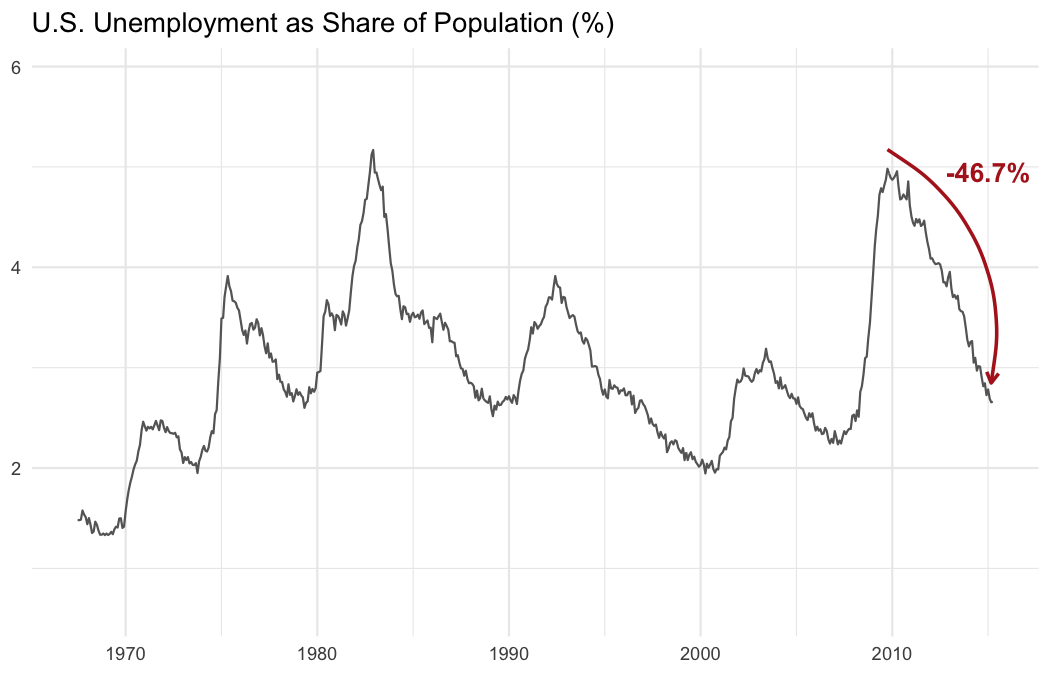
vignette("narrating-business-charts") — full
walkthrough with customization, multiple annotations, and common
mistakes.?annotate_callout and ?annotate_change —
function reference with all arguments and examples.ggmemo is focused on callout and change annotations for business charts. For other annotation needs:
Please note that the ggmemo project is released with a Contributor Code of Conduct. By contributing to this project, you agree to abide by its terms.
These binaries (installable software) and packages are in development.
They may not be fully stable and should be used with caution. We make no claims about them.
Health stats visible at Monitor.