
The hardware and bandwidth for this mirror is donated by dogado GmbH, the Webhosting and Full Service-Cloud Provider. Check out our Wordpress Tutorial.
If you wish to report a bug, or if you are interested in having us mirror your free-software or open-source project, please feel free to contact us at mirror[@]dogado.de.
gglorenzThe goal of gglorenz is to plot Lorenz Curves with the
blessing of ggplot2.
# Install the CRAN version
install.packages("gglorenz")

# Install the development version from GitHub:
# install.packages("remotes")
remotes::install_github("jjchern/gglorenz")Suppose you have a vector with each element representing the amount
of income or wealth a person produced, and you are interested in knowing
how much of that is produced by the top x% of the population, then the
gglorenz::stat_lorenz(desc = TRUE) would make a ggplot2
graph for you.
library(tidyverse)
#> ── Attaching packages ─────────────────────────────────────────────────────────────────────── tidyverse 1.2.1 ──
#> ✓ ggplot2 3.3.0          ✓ purrr   0.3.3.9000
#> ✓ tibble  3.0.1          ✓ dplyr   0.8.3
#> ✓ tidyr   0.8.3          ✓ stringr 1.4.0
#> ✓ readr   1.3.1          ✓ forcats 0.4.0
#> ── Conflicts ────────────────────────────────────────────────────────────────────────── tidyverse_conflicts() ──
#> x dplyr::filter() masks stats::filter()
#> x dplyr::lag()    masks stats::lag()
library(gglorenz)

billionaires
#> # A tibble: 500 x 6
#>    Rank  Name            Total_Net_Worth Country       Industry      TNW
#>    <chr> <chr>           <chr>           <chr>         <chr>       <dbl>
#>  1 1     Jeff Bezos      $118B           United States Technology  118
#>  2 2     Bill Gates      $91.3B          United States Technology   91.3
#>  3 3     Warren Buffett  $86.1B          United States Diversified  86.1
#>  4 4     Mark Zuckerberg $74.3B          United States Technology   74.3
#>  5 5     Amancio Ortega  $71.7B          Spain         Retail       71.7
#>  6 6     Bernard Arnault $65.0B          France        Consumer     65
#>  7 7     Carlos Slim     $64.7B          Mexico        Diversified  64.7
#>  8 8     Larry Ellison   $54.7B          United States Technology   54.7
#>  9 9     Larry Page      $52.6B          United States Technology   52.6
#> 10 10    Sergey Brin     $51.2B          United States Technology   51.2
#> # … with 490 more rows

billionaires %>%
    ggplot(aes(TNW)) +
    stat_lorenz(desc = TRUE) +
    coord_fixed() +
    geom_abline(linetype = "dashed") +
    theme_minimal() +
    hrbrthemes::scale_x_percent() +
    hrbrthemes::scale_y_percent() +
    hrbrthemes::theme_ipsum_rc() +
    labs(x = "Cumulative Percentage of the Top 500 Billionaires",
         y = "Cumulative Percentage of Total Net Worth",
         title = "Inequality Among Billionaires",
         caption = "Source: https://www.bloomberg.com/billionaires/ (accessed February 8, 2018)")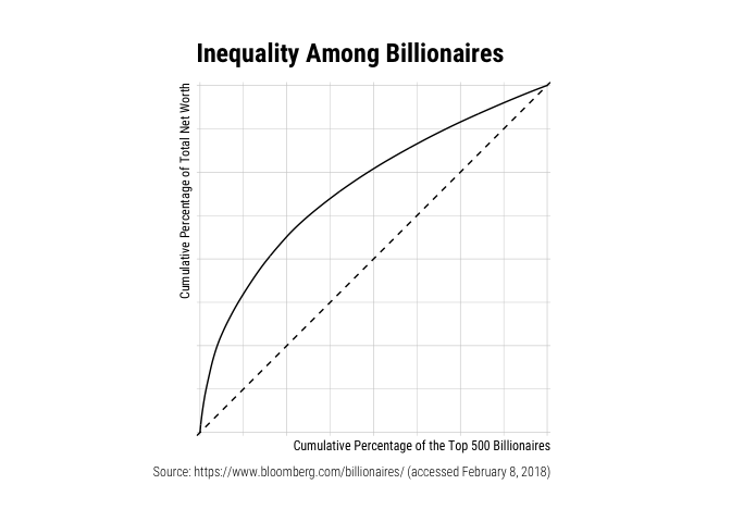
billionaires %>%
    filter(Industry %in% c("Technology", "Real Estate")) %>%
    ggplot(aes(x = TNW, colour = Industry)) +
    stat_lorenz(desc = TRUE) +
    coord_fixed() +
    geom_abline(linetype = "dashed") +
    theme_minimal() +
    hrbrthemes::scale_x_percent() +
    hrbrthemes::scale_y_percent() +
    hrbrthemes::theme_ipsum_rc() +
    labs(x = "Cumulative Percentage of Billionaires",
         y = "Cumulative Percentage of Total Net Worth",
         title = "Real Estate is a Relatively Equal Field",
         caption = "Source: https://www.bloomberg.com/billionaires/ (accessed February 8, 2018)")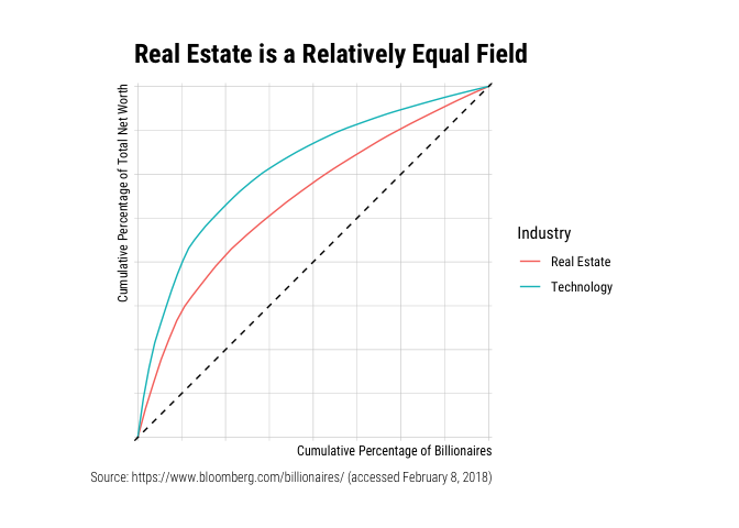
The annotate_ineq() function allows you to label the
chart with inequality statistics such as the Gini coefficient:
billionaires %>%
    ggplot(aes(TNW)) +
    stat_lorenz(desc = TRUE) +
    coord_fixed() +
    geom_abline(linetype = "dashed") +
    theme_minimal() +
    hrbrthemes::scale_x_percent() +
    hrbrthemes::scale_y_percent() +
    hrbrthemes::theme_ipsum_rc() +
    labs(x = "Cumulative Percentage of the Top 500 Billionaires",
         y = "Cumulative Percentage of Total Net Worth",
         title = "Inequality Among Billionaires",
         caption = "Source: https://www.bloomberg.com/billionaires/ (accessed February 8, 2018)") +
    annotate_ineq(billionaires$TNW)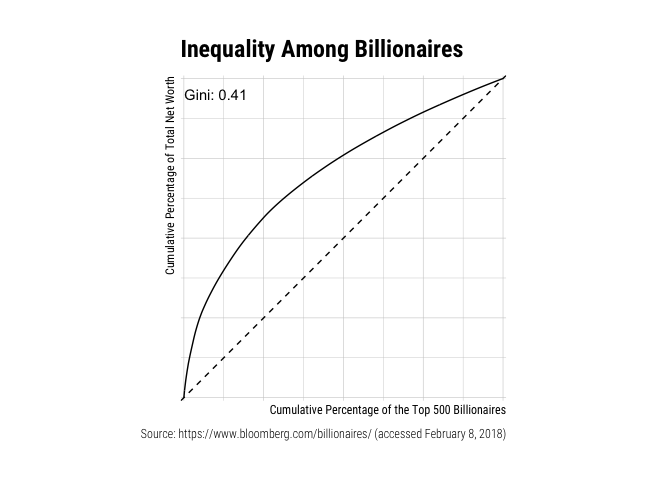
You can also use other geoms such as area or
polygon and arranging population in ascending order:
billionaires %>%
    filter(Industry %in% c("Technology", "Real Estate")) %>%
    add_row(Industry = "Perfect Equality", TNW = 1) %>%
    ggplot(aes(x = TNW, fill = Industry)) +
    stat_lorenz(geom = "area", alpha = 0.65) +
    coord_fixed() +
    hrbrthemes::scale_x_percent() +
    hrbrthemes::scale_y_percent() +
    hrbrthemes::theme_ipsum_rc() +
    theme(legend.title = element_blank()) +
    labs(x = "Cumulative Percentage of Billionaires",
         y = "Cumulative Percentage of Total Net Worth",
         title = "Real Estate is a Relatively Equal Field",
         caption = "Source: https://www.bloomberg.com/billionaires/ (accessed February 8, 2018)")
billionaires %>%
    filter(Industry %in% c("Technology", "Real Estate")) %>%
    mutate(Industry = forcats::as_factor(Industry)) %>%
    ggplot(aes(x = TNW, fill = Industry)) +
    stat_lorenz(geom = "polygon", alpha = 0.65) +
    geom_abline(linetype = "dashed") +
    coord_fixed() +
    hrbrthemes::scale_x_percent() +
    hrbrthemes::scale_y_percent() +
    hrbrthemes::theme_ipsum_rc() +
    theme(legend.title = element_blank()) +
    labs(x = "Cumulative Percentage of Billionaires",
         y = "Cumulative Percentage of Total Net Worth",
         title = "Real Estate is a Relatively Equal Field",
         caption = "Source: https://www.bloomberg.com/billionaires/ (accessed February 8, 2018)")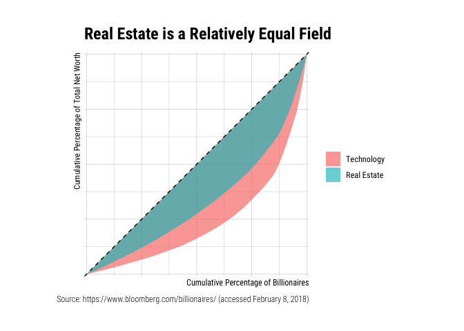
The package came to exist solely because Bob Rudis was generous enough
to write a chapter that demystifies
ggplot2.
These binaries (installable software) and packages are in development.
They may not be fully stable and should be used with caution. We make no claims about them.
Health stats visible at Monitor.