

The hardware and bandwidth for this mirror is donated by dogado GmbH, the Webhosting and Full Service-Cloud Provider. Check out our Wordpress Tutorial.
If you wish to report a bug, or if you are interested in having us mirror your free-software or open-source project, please feel free to contact us at mirror[@]dogado.de.

ggcorrplot draws a correlation matrix as a
ggplot2 plot. Because the result is a plain ggplot
object, you can restyle it, annotate it, and combine it with other
layers using the usual + syntax.
It can:
cor_pmat().Learn more in ggcorrplot: Correlation Matrix Heatmap in R with ggplot2.
Install the released version from CRAN:
install.packages("ggcorrplot")Or the development version from GitHub:
if (!require(devtools)) install.packages("devtools")
devtools::install_github("kassambara/ggcorrplot")library(ggcorrplot)The examples below use the mtcars data set.
cor() builds the correlation matrix and
cor_pmat() [in ggcorrplot] computes the
matrix of correlation p-values.
data(mtcars)
corr <- round(cor(mtcars), 1)
corr[1:4, 1:4]
#>       mpg  cyl disp   hp
#> mpg   1.0 -0.9 -0.8 -0.8
#> cyl  -0.9  1.0  0.9  0.8
#> disp -0.8  0.9  1.0  0.8
#> hp   -0.8  0.8  0.8  1.0

# Matrix of correlation p-values
p.mat <- cor_pmat(mtcars)
p.mat[1:4, 1:4]
#>               mpg          cyl         disp           hp
#> mpg  0.000000e+00 6.112687e-10 9.380327e-10 1.787835e-07
#> cyl  6.112687e-10 0.000000e+00 1.802838e-12 3.477861e-09
#> disp 9.380327e-10 1.802838e-12 0.000000e+00 7.142679e-08
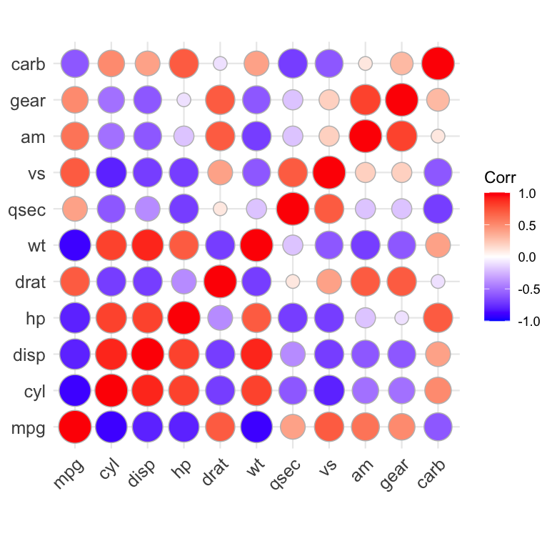
#> hp 1.787835e-07 3.477861e-09 7.142679e-08 0.000000e+00The default draws each correlation as a colored square;
method = "circle" encodes the value with the circle area
instead.
ggcorrplot(corr)
ggcorrplot(corr, method = "circle")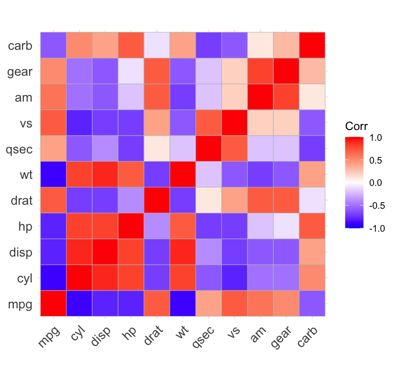
scale.square = TRUE sizes the squares by the absolute
correlation, so strong correlations dominate;
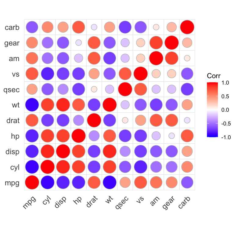
cell.grid = TRUE draws a light box around every cell so the
glyphs sit inside a grid instead of floating on the axis lines.
ggcorrplot(corr, scale.square = TRUE, cell.grid = TRUE, outline.color = "white")
ggcorrplot(corr, method = "circle", cell.grid = TRUE)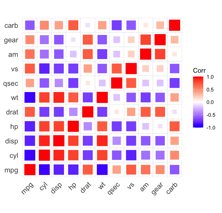
hc.order = TRUE reorders the variables by hierarchical
clustering so that correlated variables sit together.
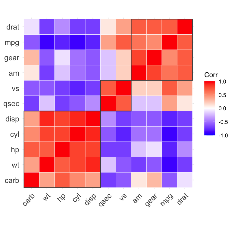
hc.rect then draws rectangles around the clusters obtained
by cutting the tree.
ggcorrplot(corr, hc.order = TRUE, outline.color = "white")
ggcorrplot(corr, hc.order = TRUE, hc.rect = 3, outline.color = "white")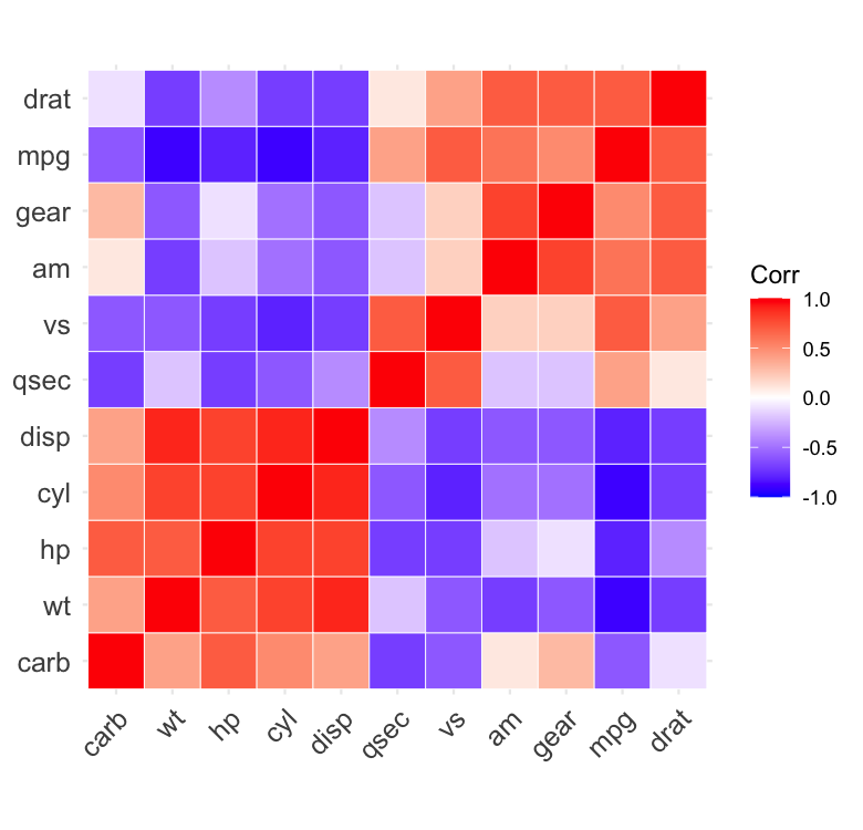
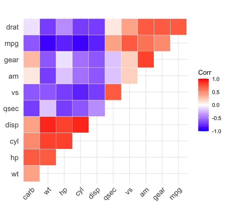
For a symmetric matrix the two triangles are redundant, so you can keep just one.
ggcorrplot(corr, hc.order = TRUE, type = "lower", outline.color = "white")
ggcorrplot(corr, hc.order = TRUE, type = "upper", outline.color = "white")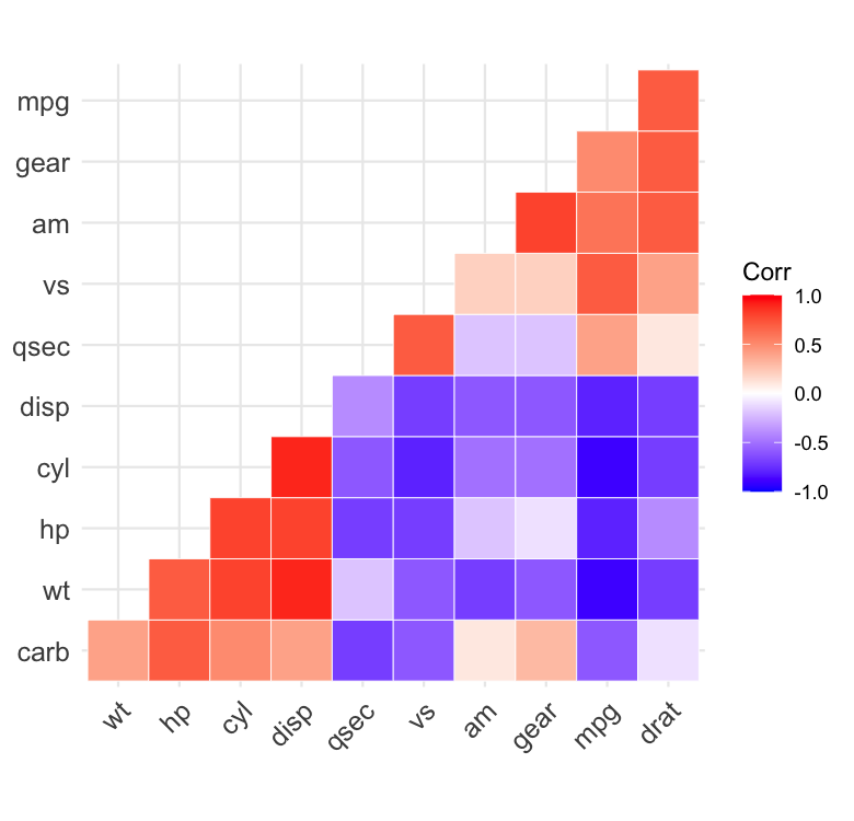
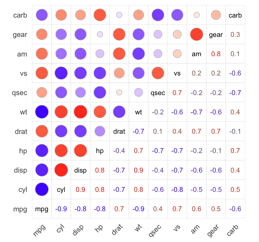
lower.method and upper.method draw a
different glyph in each triangle — here the
coefficients as numbers below the diagonal and circles above it, with
the variable names on the diagonal. Adding cell.grid = TRUE
boxes every cell for the tidy corrplot look.
ggcorrplot(corr,
  lower.method = "number", upper.method = "circle",
  cell.grid = TRUE, show.legend = FALSE
)
ggcorrplot(corr, hc.order = TRUE, type = "lower", lab = TRUE)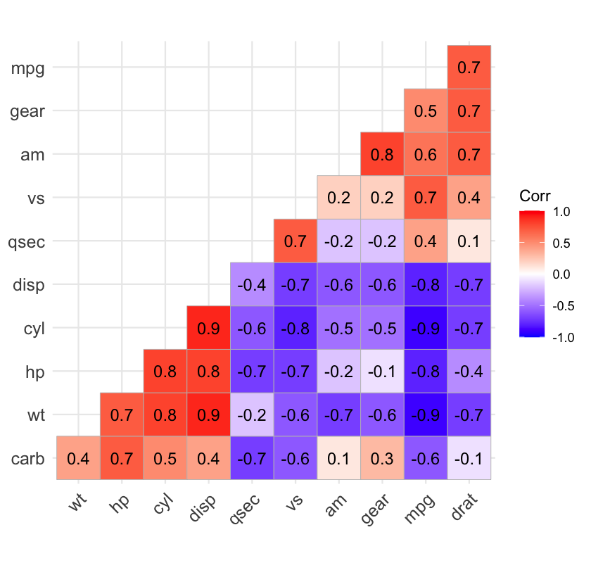
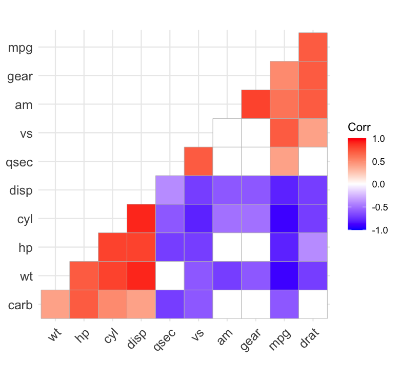
Passing p.mat marks the cells whose correlation is not
significant at sig.level (default 0.05). By default a cross
is drawn over them (insig = "pch");
insig = "blank" hides them instead.
# Cross out the non-significant coefficients
ggcorrplot(corr, hc.order = TRUE, type = "lower", p.mat = p.mat)
# Leave them blank
ggcorrplot(corr, hc.order = TRUE, type = "lower", p.mat = p.mat, insig = "blank")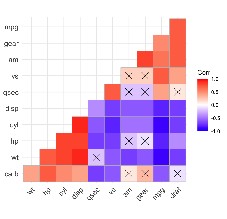
insig = "stars" flips the emphasis: instead of crossing
out the non-significant cells, it marks the significant
ones with significance stars (***, **,
* for p <= 0.001, 0.01, 0.05 – fixed thresholds, not
sig.level). With the default lab = FALSE this
is a standalone significance map; with lab = TRUE the stars
are appended to the coefficients (e.g. -0.85***).
ggcorrplot(corr, p.mat = p.mat, insig = "stars")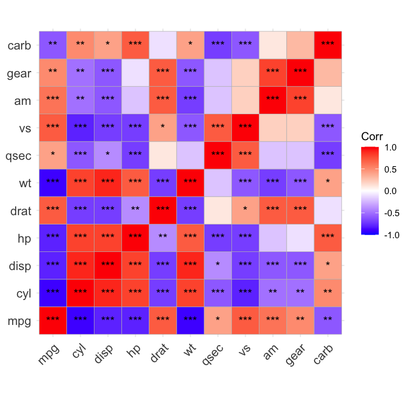
ggcorrplot() returns a ggplot object, so any ggplot2
theme applies. colors sets the low / mid / high gradient.
For the ggplot2 side of this, see ggplot2
Colours in R: Change Colours by Group and ggplot2
Themes in R: Customize the Look.
ggcorrplot(corr,
  hc.order = TRUE, type = "lower", outline.color = "white",
  ggtheme = ggplot2::theme_gray,
  colors = c("#6D9EC1", "white", "#E46726")
)
These binaries (installable software) and packages are in development.
They may not be fully stable and should be used with caution. We make no claims about them.
Health stats visible at Monitor.