The hardware and bandwidth for this mirror is donated by dogado GmbH, the Webhosting and Full Service-Cloud Provider. Check out our Wordpress Tutorial.
If you wish to report a bug, or if you are interested in having us mirror your free-software or open-source project, please feel free to contact us at mirror[@]dogado.de.
The R package ggbump creates elegant bump charts in
ggplot.Bump charts are good to use to plot ranking over time.
You can install the released version of ggbump from github with:
devtools::install_github("davidsjoberg/ggbump")Basic example:
A more advanced example:
Click here for code to the plot above
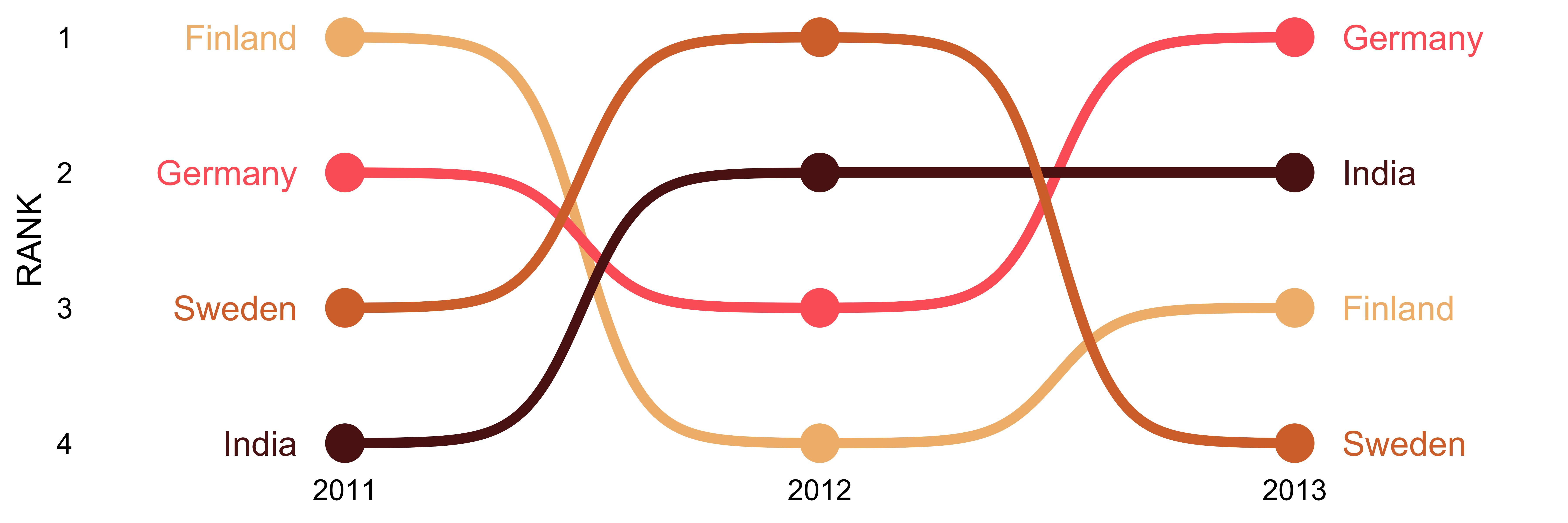
Flags could be used instead of names:
Click here for code to the plot above
With geom_sigmoid you can make custom sigmoid
curves:
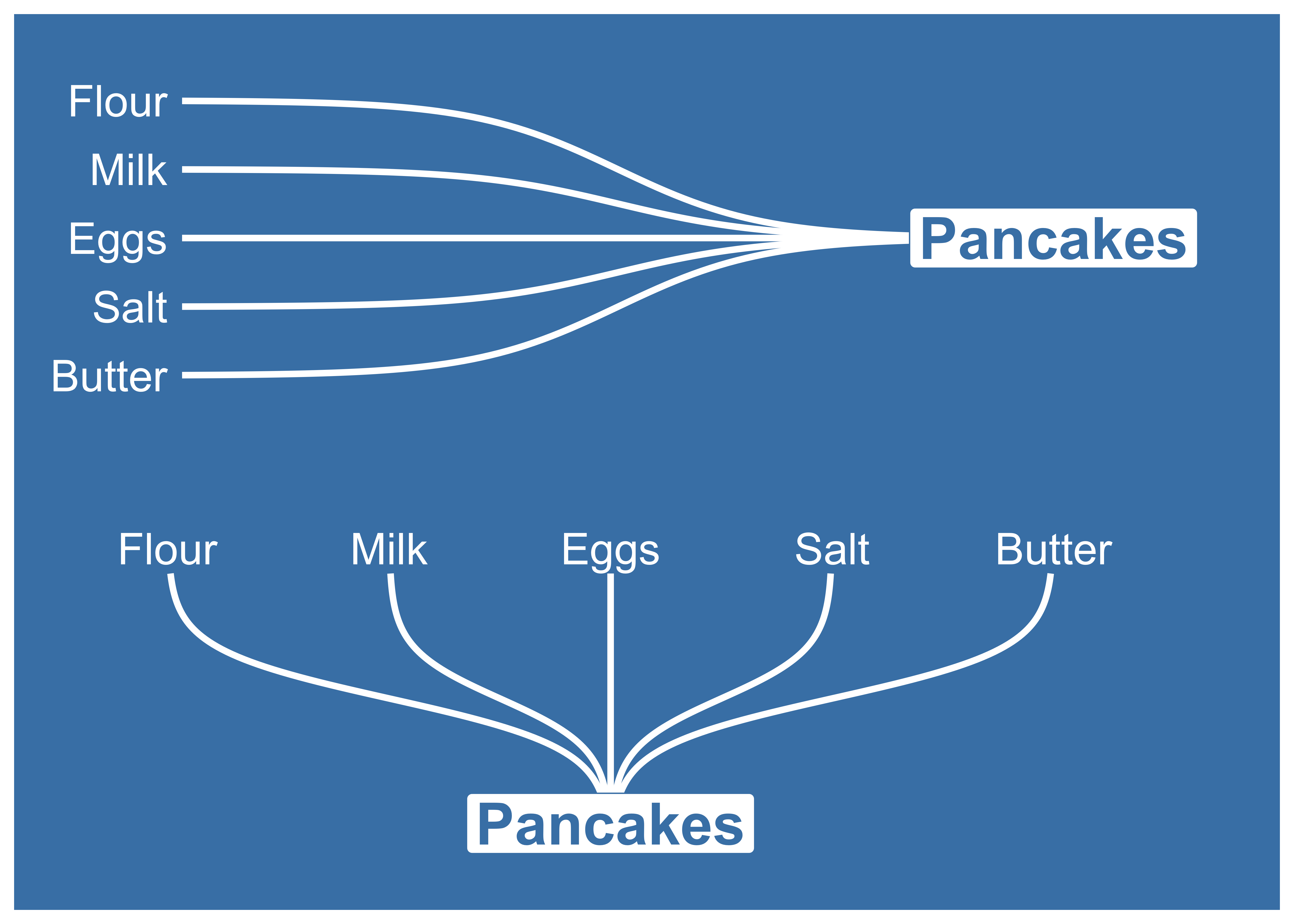
Click here for code to the plot above
Load packages and get some data with rank:
if(!require(pacman)) install.packages("pacman")
library(ggbump)
pacman::p_load(tidyverse, cowplot, wesanderson)

df <- tibble(country = c("India", "India", "India", "Sweden", "Sweden", "Sweden", "Germany", "Germany", "Germany", "Finland", "Finland", "Finland"),
             year = c(2011, 2012, 2013, 2011, 2012, 2013, 2011, 2012, 2013, 2011, 2012, 2013),
             rank = c(4, 2, 2, 3, 1, 4, 2, 3, 1, 1, 4, 3))

knitr::kable(head(df))| country | year | rank |
|---|---|---|
| India | 2011 | 4 |
| India | 2012 | 2 |
| India | 2013 | 2 |
| Sweden | 2011 | 3 |
| Sweden | 2012 | 1 |
| Sweden | 2013 | 4 |
Most simple use case:
ggplot(df, aes(year, rank, color = country)) +
    geom_bump()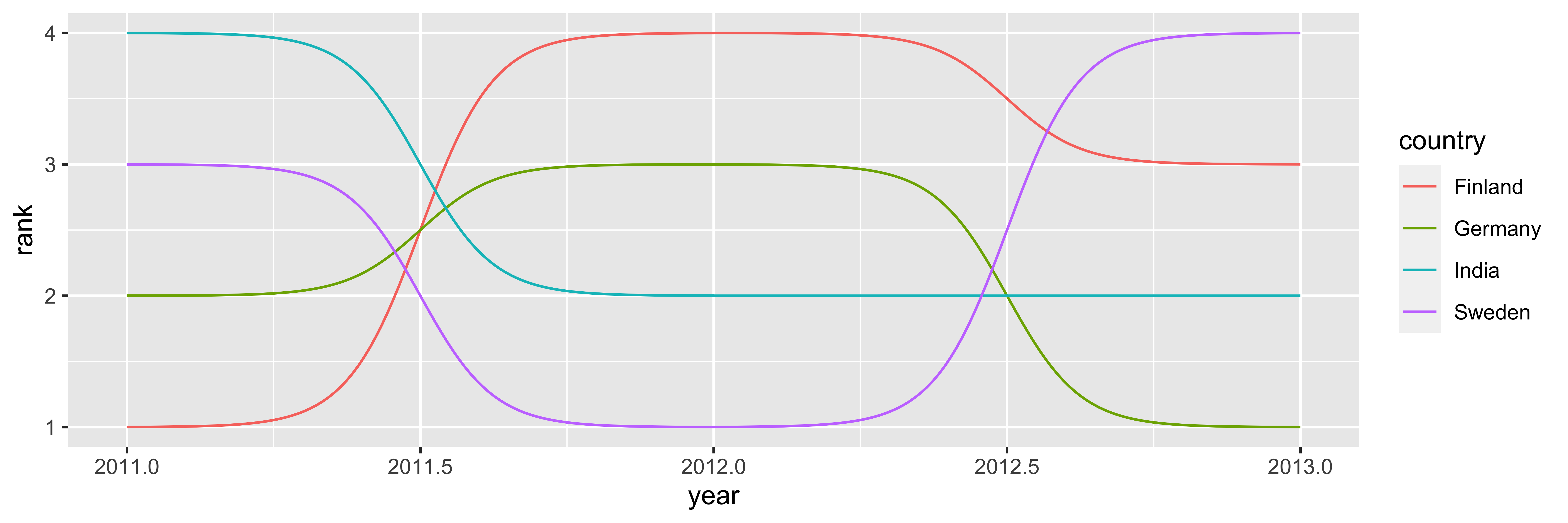
Improve the bump chart by adding:
theme_minimal_grid() from
cowplot.wesanderson.smooth
to 8. Higher means less smooth.
ggplot(df, aes(year, rank, color = country)) +
  geom_point(size = 7) +
  geom_text(data = df %>% filter(year == min(year)),
            aes(x = year - .1, label = country), size = 5, hjust = 1) +
  geom_text(data = df %>% filter(year == max(year)),
            aes(x = year + .1, label = country), size = 5, hjust = 0) +
  geom_bump(size = 2, smooth = 8) +
  scale_x_continuous(limits = c(2010.6, 2013.4),
                     breaks = seq(2011, 2013, 1)) +
  theme_minimal_grid(font_size = 14, line_size = 0) +
  theme(legend.position = "none",
        panel.grid.major = element_blank()) +
  labs(y = "RANK",
       x = NULL) +
  scale_y_reverse() +
  scale_color_manual(values = wes_palette(n = 4, name = "GrandBudapest1"))
To use geom_bump with factors or character axis you need
to prepare the data frame before. You need to prepare one column for the
numeric position and one column with the name. If you want to have
character/factor on both y and x you need to prepare 4 columns.
# Original df
df <- tibble(season = c("Spring", "Summer", "Autumn", "Winter",
                        "Spring", "Summer", "Autumn", "Winter",
                        "Spring", "Summer", "Autumn", "Winter"),
             position = c("Gold", "Gold", "Bronze", "Gold",
                          "Silver", "Bronze", "Gold", "Silver",
                          "Bronze", "Silver", "Silver", "Bronze"),
             player = c(rep("David", 4),
                        rep("Anna", 4),
                        rep("Franz", 4)))

# Create factors and numeric columns
df <- df %>%
  mutate(season = factor(season,
                         levels = c("Spring", "Summer", "Autumn", "Winter")),
         x = as.numeric(season),
         position = factor(position,
                           levels = c("Gold", "Silver", "Bronze")),
         y = as.numeric(position))

# Add manual axis labels to plot
p <- ggplot(df, aes(x, y, color = player)) +
  geom_bump(size = 2, smooth = 8, show.legend = F) +
  geom_point(size = 5, aes(shape = player)) +
  scale_x_continuous(breaks = df$x %>% unique(),
                     labels = df$season %>% levels()) +
  scale_y_reverse(breaks = df$y %>% unique(),
                     labels = df$position %>% levels())
p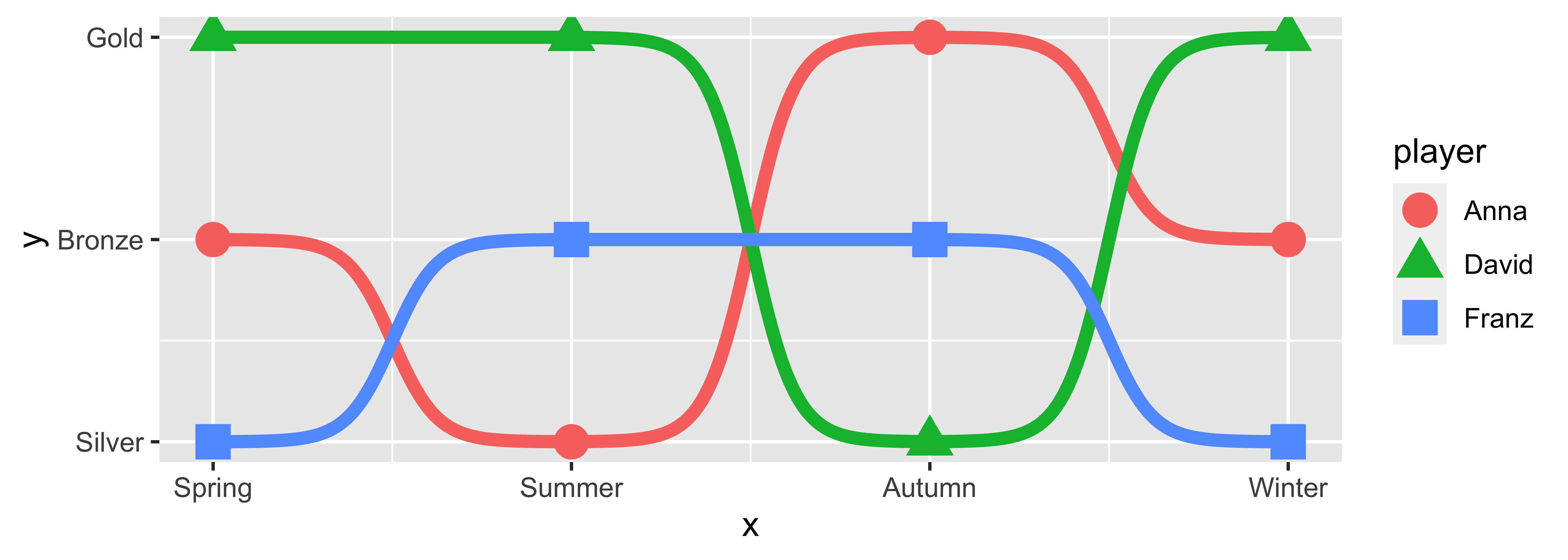
p +
  theme_minimal_grid(font_size = 14, line_size = 0) +
  theme(panel.grid.major = element_blank(),
        axis.ticks = element_blank()) +
  labs(y = "Medal",
       x = "Season",
       color = NULL,
       shape = NULL) +
  scale_color_manual(values = wes_palette(n = 3, name = "IsleofDogs1"))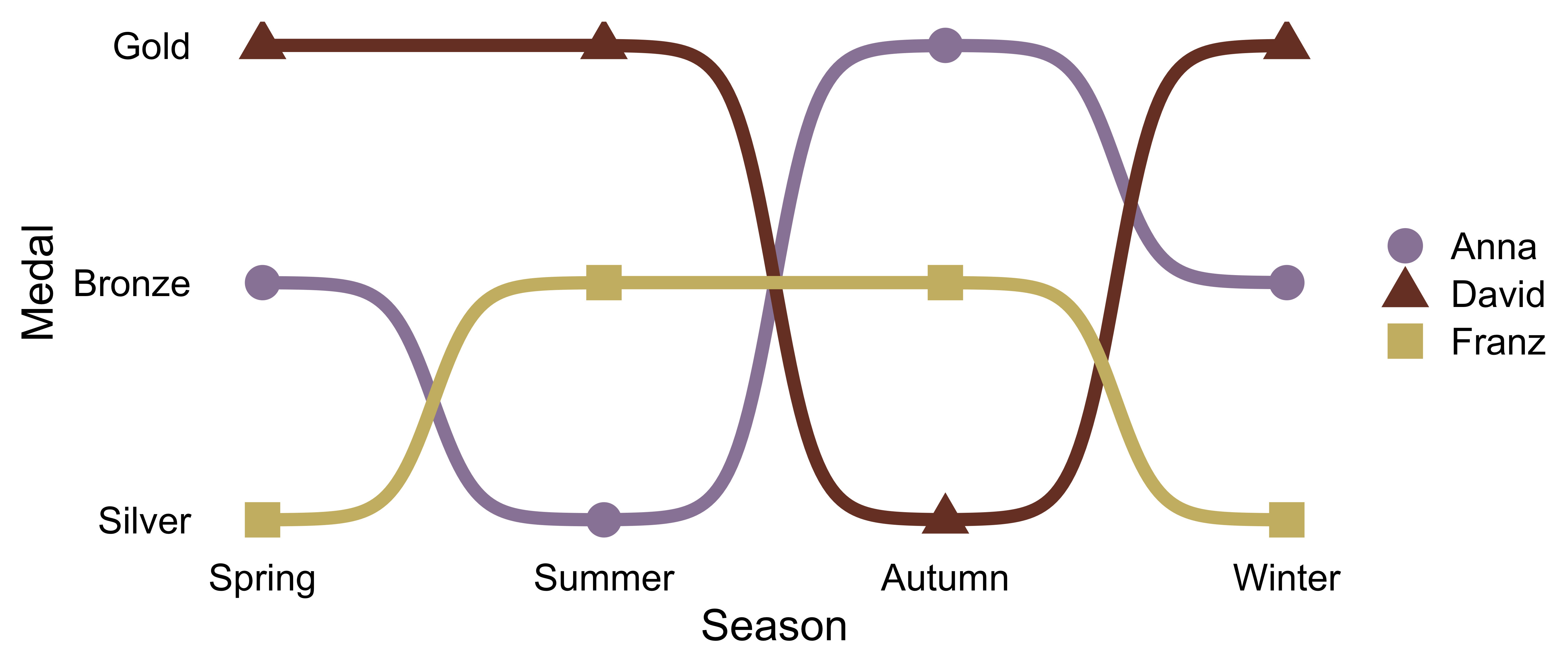
If you find any error or have suggestions for improvements you are more than welcome to contact me :)
These binaries (installable software) and packages are in development.
They may not be fully stable and should be used with caution. We make no claims about them.
Health stats visible at Monitor.