The hardware and bandwidth for this mirror is donated by dogado GmbH, the Webhosting and Full Service-Cloud Provider. Check out our Wordpress Tutorial.
If you wish to report a bug, or if you are interested in having us mirror your free-software or open-source project, please feel free to contact us at mirror[@]dogado.de.
![]()

![]()
Leverages dplyr to process the calculations of a plot
inside a database. This package provides helper functions that abstract
the work at three levels:
ggplot2 objectdata.frame object with the
calculationsYou can install the released version from CRAN:
install.packages("dbplot")Or the development version from GitHub, using the
remotes package:
install.packages("remotes")
pak::pak("edgararuiz/dbplot")For more information on how to connect to databases, including Hive, please visit https://solutions.posit.co/connections/db/
To use Spark, please visit the sparklyr official
website: https://spark.posit.co
The functions work with standard database connections (via DBI/dbplyr) and with Spark connections (via sparklyr). A local DuckDB database will be used for the examples in this README.
library(DBI)
library(dplyr)

con <- dbConnect(duckdb::duckdb(), ":memory:")
db_flights <- copy_to(con, nycflights13::flights, "flights")ggplotBy default dbplot_histogram() creates a 30 bin
histogram
library(ggplot2)

db_flights |>
  dbplot_histogram(distance)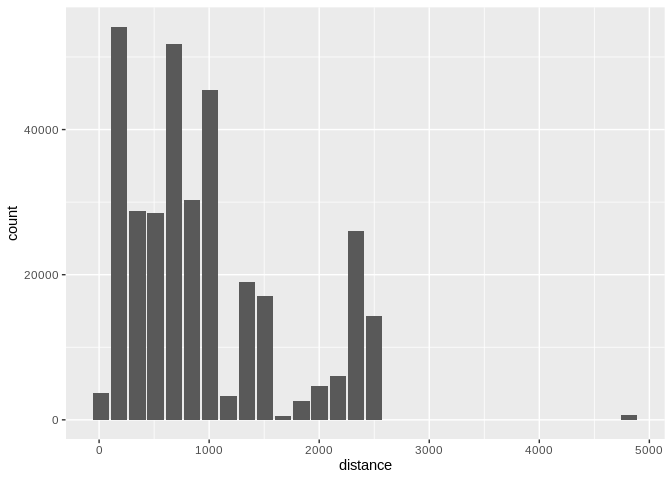
Histogram of flight distances with default 30 bins
Use binwidth to fix the bin size
db_flights |>
  dbplot_histogram(distance, binwidth = 400)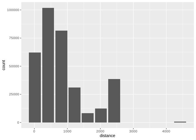
Histogram of flight distances with 400-unit bins
Because it outputs a ggplot2 object, more customization
can be done
db_flights |>
  dbplot_histogram(distance, binwidth = 400) +
  labs(title = "Flights - Distance traveled") +
  theme_bw()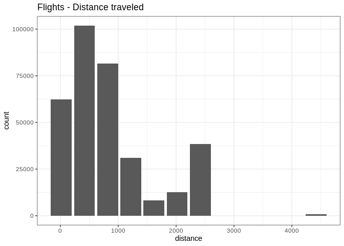
Customized histogram with title and theme
To visualize two continuous variables, we typically resort to a Scatter plot. However, this may not be practical when visualizing millions or billions of dots representing the intersections of the two variables. A Raster plot may be a better option, because it concentrates the intersections into squares that are easier to parse visually.
A Raster plot basically does the same as a Histogram. It takes two continuous variables and creates discrete 2-dimensional bins represented as squares in the plot. It then determines either the number of rows inside each square or processes some aggregation, like an average.
fill argument is passed, the default calculation
will be count, n()db_flights |>
dbplot_raster(sched_dep_time, sched_arr_time)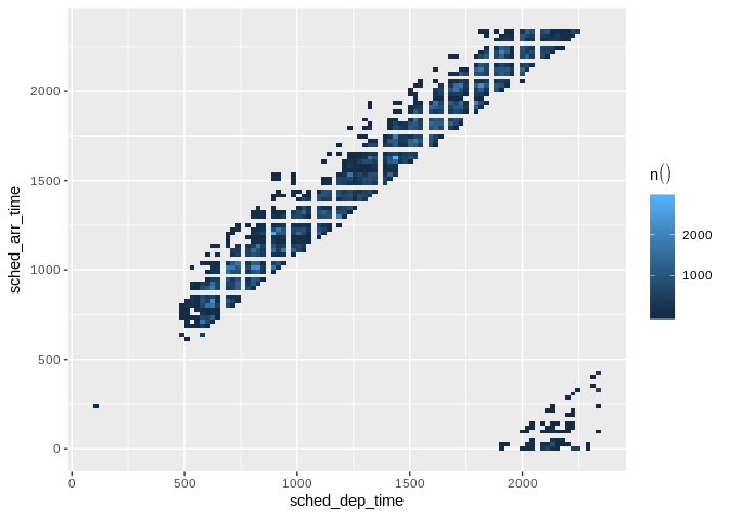
Raster plot of scheduled departure and arrival times
db_flights |>
  dbplot_raster(
    sched_dep_time,
    sched_arr_time,
    mean(distance, na.rm = TRUE)
    )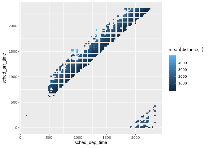
Raster plot showing average flight distance by time
resolution argument controls that, it defaults to 100db_flights |>
dbplot_raster(
sched_dep_time,
sched_arr_time,
mean(distance, na.rm = TRUE),
resolution = 20
)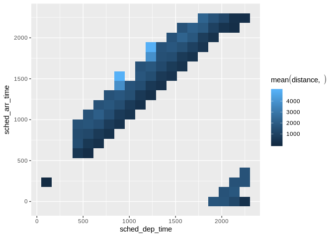
Raster plot with lower resolution (20x20 grid)
dbplot_bar() defaults to a count() of each value in a
discrete variabledb_flights |>
dbplot_bar(origin)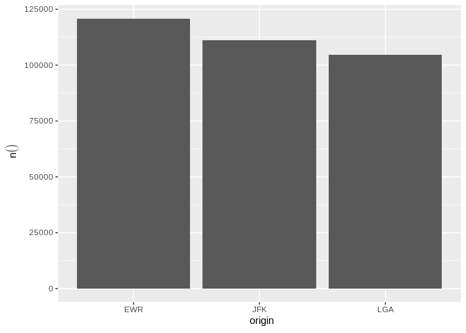
Bar plot of flight counts by origin airport
db_flights |>
  dbplot_bar(origin, avg_delay =  mean(dep_delay, na.rm = TRUE))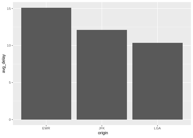
Bar plot of average departure delay by origin airport
dbplot_line() defaults to a count() of each value in a
discrete variabledb_flights |>
dbplot_line(month)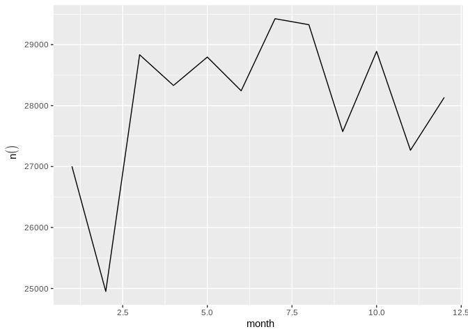
Line plot of flight counts by month
db_flights |>
  dbplot_line(month, avg_delay = mean(dep_delay, na.rm = TRUE))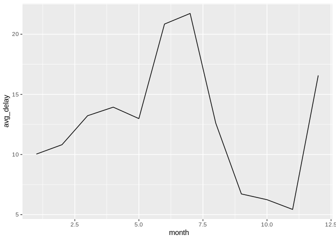
Line plot of average departure delay by month
It expects a discrete variable to group by, and a continuous variable to calculate the percentiles and IQR. It doesn’t calculate outliers.
Boxplot functions require database support for percentile/quantile calculations.
Supported databases:
quantile()percentile_approx()PERCENTILE_CONT()percentile_cont()PERCENTILE_CONT()Not supported: SQLite, MySQL < 8.0, MariaDB (no percentile functions)
Here is an example using dbplot_boxplot() with a local
data frame:
nycflights13::flights |>
  dbplot_boxplot(origin, distance)
Boxplot of flight distances by origin airport (local data)
Boxplot also works with database connections that support quantile functions:
db_flights |>
  dbplot_boxplot(origin, distance)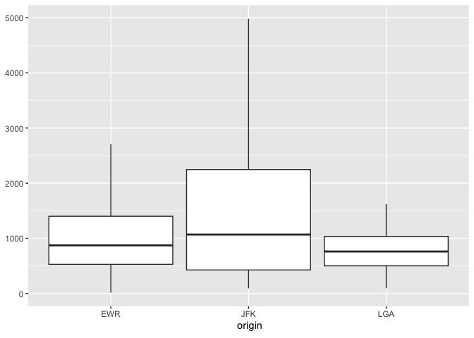
Boxplot of flight distances by origin airport (DuckDB)
If a more customized plot is needed, the data the underpins the plots can also be accessed:
db_compute_bins() - Returns a data frame with the bins
and count per bindb_compute_count() - Returns a data frame with the
count per discrete valuedb_compute_raster() - Returns a data frame with the
results per x/y intersectiondb_compute_raster2() - Returns same as
db_compute_raster() function plus the coordinates of the
x/y boxesdb_compute_boxplot() - Returns a data frame with
boxplot calculationsdb_flights |>
db_compute_bins(arr_delay)
#> # A tibble: 28 × 2
#> arr_delay count
#> <dbl> <dbl>
#> 1 95.1 7890
#> 2 321. 232
#> 3 729. 5
#> 4 548. 6
#> 5 684. 1
#> 6 -40.7 207999
#> 7 NA 9430
#> 8 276. 425
#> 9 457. 23
#> 10 593 6
#> # ℹ 18 more rowsThe data can be piped to a plot
db_flights |>
  filter(arr_delay < 100 , arr_delay > -50) |>
  db_compute_bins(arr_delay) |>
  ggplot() +
  geom_col(aes(arr_delay, count, fill = count))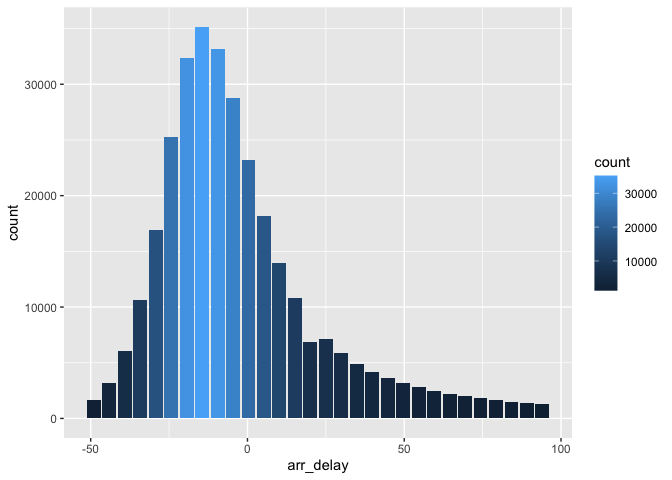
Custom histogram of arrival delays using db_compute_bins
db_bin()Uses ‘rlang’ to build the formula needed to create the bins of a numeric variable in an un-evaluated fashion. This way, the formula can be then passed inside a dplyr verb.
db_bin(var)
#> (((max(var, na.rm = TRUE) - min(var, na.rm = TRUE))/30) * ifelse(as.integer(floor((var -
#>     min(var, na.rm = TRUE))/((max(var, na.rm = TRUE) - min(var,
#>     na.rm = TRUE))/30))) == 30, as.integer(floor((var - min(var,
#>     na.rm = TRUE))/((max(var, na.rm = TRUE) - min(var, na.rm = TRUE))/30))) -
#>     1, as.integer(floor((var - min(var, na.rm = TRUE))/((max(var,
#>     na.rm = TRUE) - min(var, na.rm = TRUE))/30))))) + min(var,
#>     na.rm = TRUE)
db_flights |>
group_by(x = !! db_bin(arr_delay)) |>
count()
#> # Source: SQL [?? x 2]
#> # Database: DuckDB 1.4.4 [edgar@Darwin 25.3.0:R 4.5.2/:memory:]
#> # Groups: x
#> x n
#> <dbl> <dbl>
#> 1 -40.7 207999
#> 2 NA 9430
#> 3 276. 425
#> 4 457. 23
#> 5 593 6
#> 6 4.53 79784
#> 7 186. 1742
#> 8 95.1 7890
#> 9 321. 232
#> 10 729. 5
#> # ℹ more rowsdb_flights |>
filter(!is.na(arr_delay)) |>
group_by(x = !! db_bin(arr_delay)) |>
count()|>
collect() |>
ggplot() +
geom_col(aes(x, n))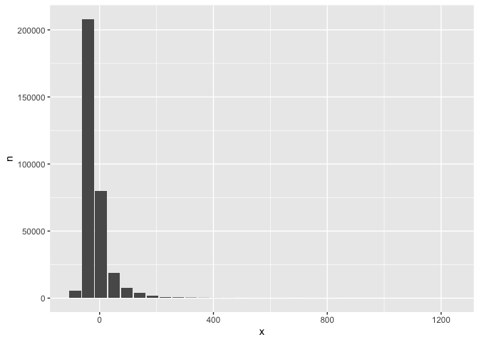
Custom histogram of arrival delays using db_bin
dbDisconnect(con)These binaries (installable software) and packages are in development.
They may not be fully stable and should be used with caution. We make no claims about them.
Health stats visible at Monitor.