
The hardware and bandwidth for this mirror is donated by dogado GmbH, the Webhosting and Full Service-Cloud Provider. Check out our Wordpress Tutorial.
If you wish to report a bug, or if you are interested in having us mirror your free-software or open-source project, please feel free to contact us at mirror[@]dogado.de.
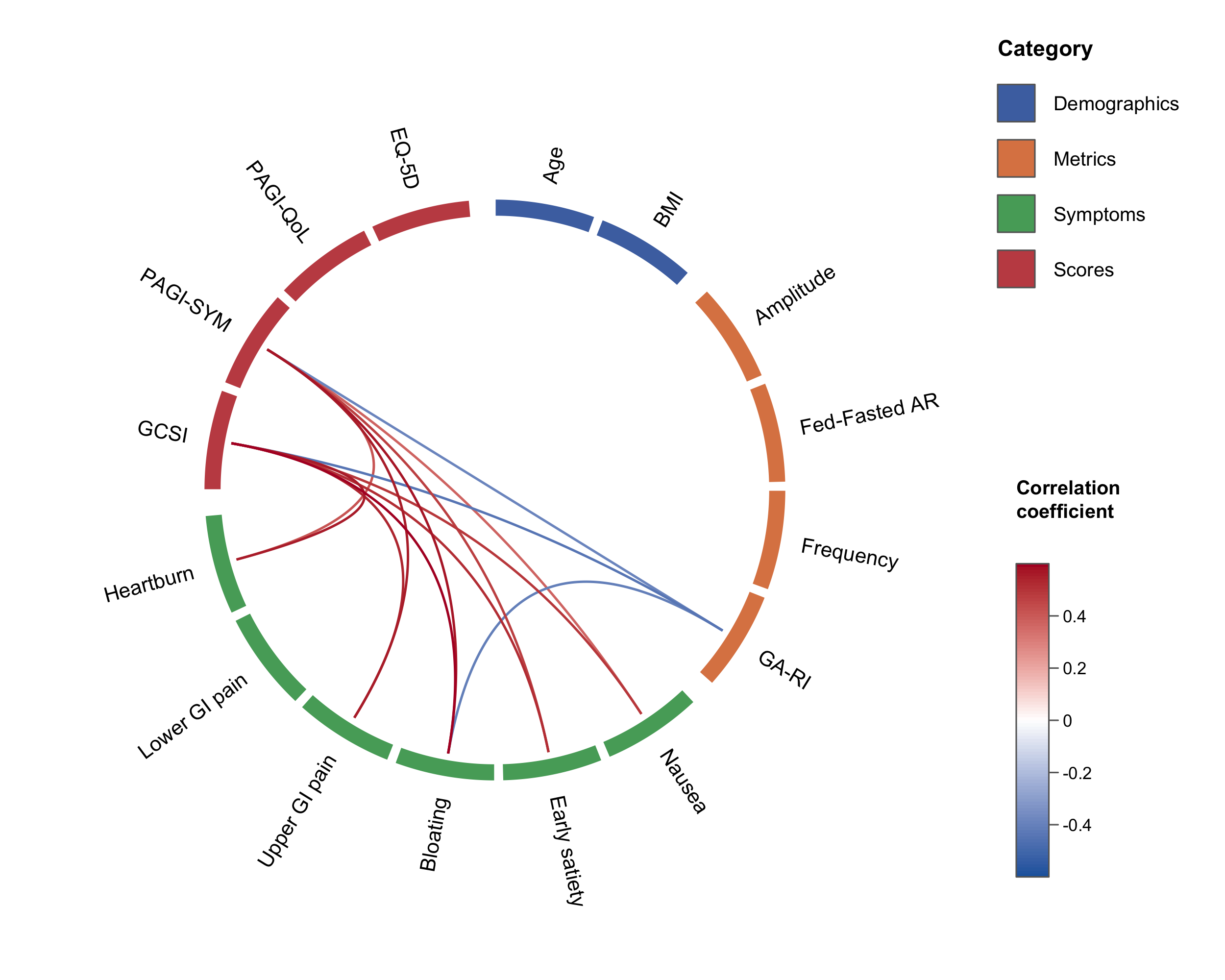
Circular correlation “wheel” plots in native R.
circlecorR draws correlation wheel
plots with variables arranged around a ring, grouped and colour-tiled by
category, connected by curved links whose colour maps to the correlation
coefficient using circlize.
A traditional correlation matrix is mostly redundant. A diagonal of
self-correlations, two mirror-image triangles, and blocks of
within-category correlations bury the between-category relationships we
care about. The wheel, first seen in Gharibans et al. (2019), keeps only
the relationships of interest. Hiding self- and within-category
correlations also removes them from the multiple-comparison
family, which improves statistical power (see
vignette("circlecorR")).
# install.packages("remotes")
remotes::install_github("kriz98/circlecorR", build_vignettes = TRUE)
(CRAN release pending.)
Dependencies (circlize and psych) install
automatically with the command above.
circlecorR is designed to work straight from a data
frame, one row per subject, one column per variable,
with no separate step to build correlation matrices yourself. Hand that
data frame to corr_wheel() and it computes the correlations
and p-values for you. The only other thing you supply is
groups, which both selects the variables and orders them
around the wheel (extra columns like IDs are ignored).
library(circlecorR)

# `gastro_symptoms` is a synthetic example dataset bundled with the package --
# swap it for your own data frame (one row per subject) to use your own data.
groups <- list(
  Demographics = c("Age", "BMI"),
  Metrics      = c("Amplitude", "Fed-Fasted AR", "Frequency", "GA-RI"),
  Symptoms     = c("Nausea", "Early satiety", "Bloating",
                   "Upper GI pain", "Lower GI pain", "Heartburn"),
  Scores       = c("GCSI", "PAGI-SYM", "PAGI-QoL", "EQ-5D")
)

corr_wheel(
  gastro_symptoms,          # one row per subject -- use your own data here
  groups      = groups,
  method      = "pearson",
  adjust      = "hochberg",
  sig_level   = 0.05,
  r_threshold = 0.3,
  r_limits    = c(-0.6, 0.6)
)png("correlation_wheel.png", width = 2400, height = 2000, res = 300)
corr_wheel(gastro_symptoms, groups = groups, r_threshold = 0.3, r_limits = c(-0.6, 0.6))
dev.off()See vignette("circlecorR") for the full tour.
Everything the reference figure controls is a plain argument:
| What | Argument | Example |
|---|---|---|
| Category assignment & order | groups |
named list or variable = category vector |
| Colour scheme (category colours + link palette, together) | scheme |
"colorblind", "ocean",
"vivid", "alimetry", or
list(colors=, palette=) |
| Category colours | colors |
c(Symptoms = "#55A868", Scores = "#C44E52") (overrides
scheme per category) |
| Pretty variable labels | labels |
c("GA-RI" = "Rhythm index") |
| Significance cutoff | sig_level |
0.05 |
| Multiple-comparison adjustment | adjust |
"holm", "hochberg", "BH",
"none" |
| Minimum |r| shown | r_threshold |
0.3 |
| Hide within-category links | hide_within_group |
TRUE / FALSE |
| Colour-scale range | r_limits |
c(-0.5, 0.5) |
| Link colour ramp | palette |
c("#2166AC", "white", "#B2182B") (overrides
scheme’s) |
| Block size (thickness) | tile_height |
0.06 (thin) … 0.12 (thick) |
| Line size (width) | link_lwd |
1.6, 3 |
| Rotation / spacing | start_degree, group_gap,
node_gap |
|
| Legend / colour bar | legend, colorbar |
Built-in schemes are listed with corr_wheel_schemes()
and inspected/tweaked with corr_wheel_scheme(); see
vignette("circlecorR") for examples.
corr_wheel() returns (invisibly) the ordered variables,
resolved group and colour maps, the colour function, and the masked
matrix actually plotted — handy for reproducibility or building a
caption.
gastro_symptoms is a bundled synthetic
dataset — fully simulated, not patient data — mimicking a
gastric-symptom study, one row per subject. It’s loaded automatically
with the package (LazyData: true), so it’s available
directly as soon as you library(circlecorR) — no
data() call needed. See ?gastro_symptoms for
details, or use it as a template for your own data’s shape.
A link between variables i and j is drawn only if all hold:
hide_within_group = TRUE), and never the same variable
(self-correlations are always excluded);p_adjusted <= sig_level; and|r| >= r_threshold.The correlations left after step 1 form the family
of comparisons. The adjust correction is applied over
only that family — so redundant self- and
within-category correlations don’t inflate the count, and power
improves. corr_wheel() returns n_tests (the
family size) and the family-adjusted p-matrix for reporting.
The correlation wheel was introduced in:
Gharibans AA, Coleman TP, Mousa H, Kunkel DC. Spatial patterns from high-resolution electrogastrography correlate with severity of symptoms in patients with functional dyspepsia and gastroparesis. Clin Gastroenterol Hepatol. 2019 Dec;17(13):2668–77.
It has since been used in several other gastric physiology studies:
These binaries (installable software) and packages are in development.
They may not be fully stable and should be used with caution. We make no claims about them.
Health stats visible at Monitor.