The hardware and bandwidth for this mirror is donated by dogado GmbH, the Webhosting and Full Service-Cloud Provider. Check out our Wordpress Tutorial.
If you wish to report a bug, or if you are interested in having us mirror your free-software or open-source project, please feel free to contact us at mirror[@]dogado.de.
UpAndDown plots display percentage changes by height and absolute changes by area for up to three hierarchical levels. They can visualise changes in indices, showing how the changes for sectors or for individual components contribute to the overall change.
install_github(“antonr4/UpAndDownPlots”)
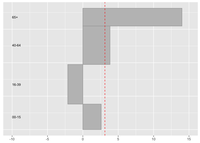
The Northern Ireland population grew by 3.12% between 2011 and 2017. What were the changes by the four age groups reported?
library(UpAndDownPlots)
popx <- ud_prep(NIpop, v1="y2011", v2="y2017", levs=c("age"), sortLev="orig")
p1 <- ud_plot(popx, labelvar="age")
p1$uadl
The 65+ age group increased by almost 20% and the 16-39 group actually declined. It is useful to note that the older group was less than half of the size of the 16-39 group in 2011.
There are more examples in the package vignettes.
These binaries (installable software) and packages are in development.
They may not be fully stable and should be used with caution. We make no claims about them.
Health stats visible at Monitor.