The hardware and bandwidth for this mirror is donated by dogado GmbH, the Webhosting and Full Service-Cloud Provider. Check out our Wordpress Tutorial.
If you wish to report a bug, or if you are interested in having us mirror your free-software or open-source project, please feel free to contact us at mirror[@]dogado.de.
In data analysis, when a metric differs between two groups, we sometimes want to investigate whether a particular subgroup is driving that difference. For example, when a key metric decline is detected compared to the previous year, you may want to conduct a more detailed analysis. In this analysis, you may focus on gender among the attributes and examine whether the decline occurred among male, female, or both. However, this type of analysis is challenging when the metric is a rate, because the magnitude of each subgroup’s contribution to the rate cannot be simply calculated, unlike in the case of volume metrics.
To address this issue, we propose an approach inspired by the story of the Ship of Theseus. This approach involves gradually replacing the components of one group with those of another, recalculating the metric at each step. The change in the metric at each step can then be interpreted as the contribution of each subgroup to the overall difference.
For instance, suppose the metric was 6.2% in 2024 and decreased to 5.2% in 2025. Again, we focus on gender. We replace the male data within the 2024 dataset with the male data from 2025 and recalculate the metric. As a result, the metric would drop by 0.8 percentage points, reaching 5.4%. In this case, the contribution of the male group to the change in the metric is -0.8 percentage points. Next, we replace the female data from 2024 with that from 2025. The dataset then consists entirely of 2025 data, and the metric drops by 0.2 percentage points, reaching 5.2%. Thus, the contribution of the female group is -0.2 percentage points.
When visualized, the results appear as follows:
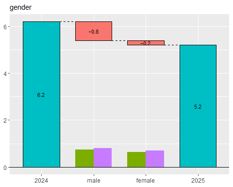
From this plot, we can see that the decline in the metric is primarily driven by the male group. We call this visualization the “Theseus Plot.”
The TheseusPlot package is designed to make it easy to generate Theseus Plots for various attributes.
You can install the TheseusPlot package from CRAN.
install.packages("TheseusPlot")You can install the development version from GitHub with:
remotes::install_github("hoxo-m/TheseusPlot")To create Theseus plots, you need two data frames that share common columns.
We use the 2013 New York City flight data from nycflights13 as a demo dataset. Here, we will define the rate metric as the proportion of flights that arrived on time. In December 2013, the on-time arrival rate dropped substantially compared to November. We investigate the cause using a Theseus plot.
First, we create an on_time column in the data frame to
indicate whether each flight arrived on time. Next, we extract the
flights for November and December into separate data frames to form two
comparison groups. The on-time arrival rate was 64% in November and
dropped to 47% in December.
library(dplyr)
library(nycflights13)

data <- flights |>
  filter(!is.na(arr_delay)) |>
  mutate(on_time = arr_delay <= 15) |>  # Arrived on time
  left_join(airlines, by = "carrier") |>
  mutate(carrier = name) |>  # Convert carrier abbreviations to full names
  select(year, month, day, origin, dest, carrier, dep_delay, on_time)

data |> head()
#> # A tibble: 6 × 8
#>    year month   day origin dest  carrier                dep_delay on_time
#>   <int> <int> <int> <chr>  <chr> <chr>                      <dbl> <lgl>
#> 1  2013     1     1 EWR    IAH   United Air Lines Inc.          2 TRUE
#> 2  2013     1     1 LGA    IAH   United Air Lines Inc.          4 FALSE
#> 3  2013     1     1 JFK    MIA   American Airlines Inc.         2 FALSE
#> 4  2013     1     1 JFK    BQN   JetBlue Airways               -1 TRUE
#> 5  2013     1     1 LGA    ATL   Delta Air Lines Inc.          -6 TRUE
#> 6  2013     1     1 EWR    ORD   United Air Lines Inc.         -4 TRUE

data_Nov <- data |> filter(month == 11)
data_Dec <- data |> filter(month == 12)

data_Nov |> summarise(on_time_rate = mean(on_time)) |> pull(on_time_rate)
#> [1] 0.8264803
data_Dec |> summarise(on_time_rate = mean(on_time)) |> pull(on_time_rate)
#> [1] 0.6738712Using the two prepared data frames, we first create a
ship object. The ship object is an instance of
the R6 class ShipOfTheseus, designed to create Theseus
plots.
library(TheseusPlot)

ship <- create_ship(data_Nov, data_Dec, y = on_time, labels = c("November", "December"))
You can create a Theseus plot by passing column names to the
plot method of a ship object. For example, to
create a Theseus plot for the airport of origin:
ship$plot(origin)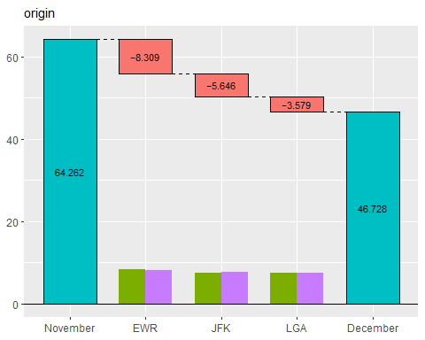
New York City has three major airports, and Newark Liberty International Airport (EWR) accounted for the largest share of the decline in the on-time arrival rate.
Note that the number of flights at each airport matters, as a larger flight volume is expected to have a greater impact. To make this clear, the Theseus plot displays the data size for each group within each subgroup as a bar chart. From this, we see that the number of flights is similar across airports, allowing for direct comparison of contributions.
In summary, a Theseus plot consists of two components:
A ship object also provides the table
method to inspect the exact values used in the Theseus plot.
ship$table(origin)
#> # A tibble: 3 × 8
#>   origin contrib    n1    n2    x1    x2 rate1 rate2
#>   <chr>    <dbl> <int> <int> <int> <int> <dbl> <dbl>
#> 1 EWR    -0.0719  9603  9410  7995  5910 0.833 0.628
#> 2 JFK    -0.0502  8645  8923  7290  6142 0.843 0.688
#> 3 LGA -0.0305 8723 8687 7006 6156 0.803 0.709When there are many subgroups, a Theseus plot can become hard to read. In such cases, you can swap the x- and y-axes for better visualization.
ship$plot_flip(carrier)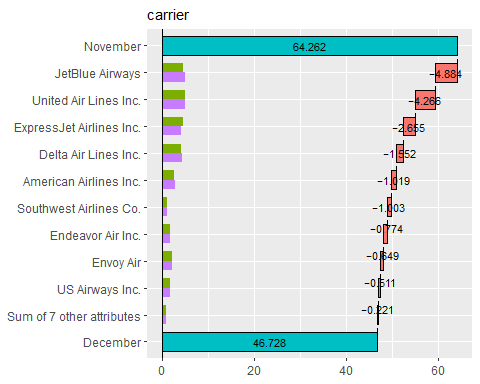
When the number of subgroups is large, those with small contributions
are automatically grouped together. By default, this happens when there
are more than 10 subgroups, but the threshold can be adjusted with the
n argument.
ship$plot_flip(carrier, n = 6)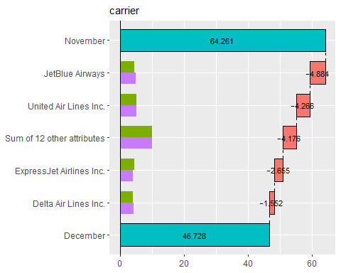
From this plot, JetBlue Airways and United Air Lines appear to have the largest contributions to the decline in on-time arrival rate.
Theseus plots do not directly support continuous variables. If a continuous column is provided, it is automatically discretized. For example, we can create a Theseus plot for departure delays.
ship$plot_flip(dep_delay)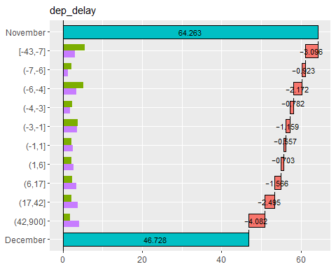
By default, continuous variables are discretized so that each
subgroup has roughly equal sample sizes, with the number of bins set to
10. You can modify these settings by passing the return value of
continuous_config() to the continuous
argument.
ship$plot_flip(dep_delay, continuous = continuous_config(n = 3))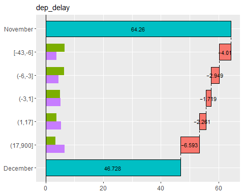
This result shows that both a decrease in on-time departures and an increase in delayed departures contributed to the decline in on-time arrival rate.
If a subgroup column is a factor, table() and
plot() respect its factor level order. This is useful when
you want to keep a meaningful predefined order, such as
"Low", "Medium", and "High",
instead of ordering categories by their contributions.
segment_order <- c("Low", "Medium", "High")

data1 <- data.frame(
  segment = factor(c("Low", "Low", "Medium", "Medium", "High", "High"), levels = segment_order),
  y = c(1, 1, 1, 0, 1, 1)
)

data2 <- data.frame(
  segment = factor(c("Low", "Low", "Medium", "Medium", "High", "High"), levels = segment_order),
  y = c(1, 0, 1, 1, 0, 0)
)

ship <- create_ship(data1, data2, y = y, labels = c("Group 1", "Group 2"))

ship$table(segment)
#> # A tibble: 3 × 8
#>   segment contrib    n1    n2    x1    x2 rate1 rate2
#>   <fct>     <dbl> <int> <int> <dbl> <dbl> <dbl> <dbl>
#> 1 Low      -0.167     2     2     2     1   1     0.5
#> 2 Medium    0.167     2     2     1     2   0.5   1
#> 3 High     -0.333     2     2     2     0   1     0

ship$plot(segment)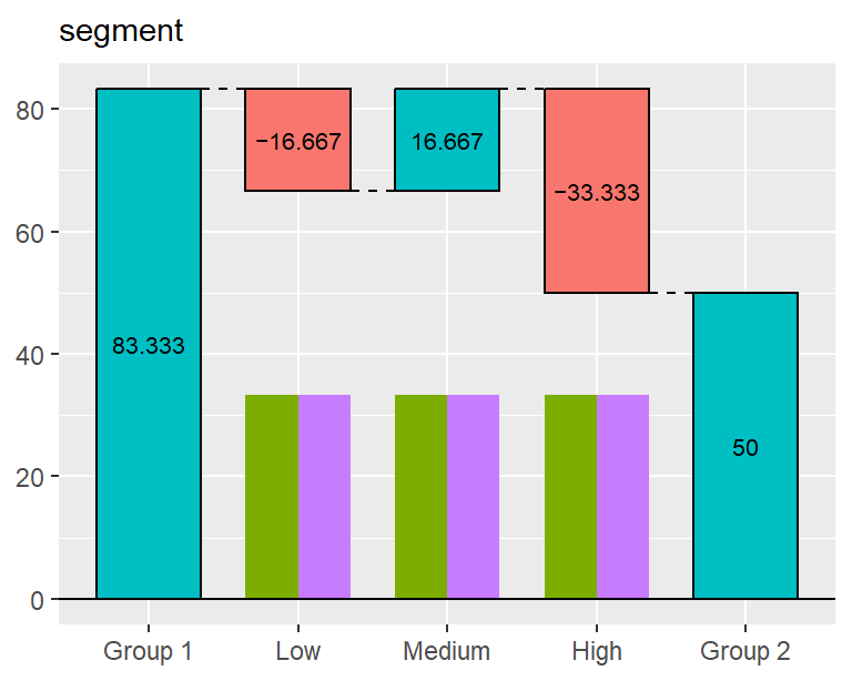
Even if the contribution of "High" is larger than that
of "Low" or "Medium", the rows and bars are
shown in the order "Low" -> "Medium" -> "High"
because segment is a factor.
By contrast, if segment were a character column, the
output would be ordered by contribution rather than by a predefined
level order.
These binaries (installable software) and packages are in development.
They may not be fully stable and should be used with caution. We make no claims about them.
Health stats visible at Monitor.