The hardware and bandwidth for this mirror is donated by dogado GmbH, the Webhosting and Full Service-Cloud Provider. Check out our Wordpress Tutorial.
If you wish to report a bug, or if you are interested in having us mirror your free-software or open-source project, please feel free to contact us at mirror[@]dogado.de.
![]()
![]()
One of the main advantages of using Generalised Linear Models is their interpretability. The goal of prettyglm is to provide a set of functions which easily create beautiful coefficient summaries which can readily be shared and explained.
prettyglm was created to solve some common faced when
building Generalised Linear Models, such as displaying categorical base
levels, and visualizing the number of records in each category on a duel
axis. Since then a number of other functions which are useful when
fitting glms have been added.
If you don’t find the function you are looking for here consider
checking out some other great packages which help visualize the output
from glms:tidycat, jtools or
GGally
You can install the latest CRAN release with:
install.packages('prettyglm')Please see the website prettyglm for more detailed documentation and examples.
To explore the functionality of prettyglm we will use a data set
sourced from kaggle
which contains information about a Portugal banks marketing campaigns
results. The campaign was based mostly on direct phone calls, offering
clients a term deposit. The target variable y indicates if
the client agreed to place the deposit after the phone call.
A critical step for this package to work well is to set all categorical predictors as factors.
library(prettyglm)
library(dplyr)
data("bank")

# Easiest way to convert multiple columns to a factor.
columns_to_factor <- c('job',
                       'marital',
                       'education',
                       'default',
                       'housing',
                       'loan')
bank_data  <- bank_data  %>%
  dplyr::filter(loan != 'unknown') %>%
  dplyr::filter(default != 'yes') %>%
  dplyr::mutate(age = as.numeric(age)) %>%
  dplyr::mutate_at(columns_to_factor, list(~factor(.))) %>% # multiple columns to factor
dplyr::mutate(T_DEPOSIT = as.factor(base::ifelse(y=='yes',1,0))) #convert target to 0 and 1 for performance plotsFor this example we will build a glm using stats::glm(),
however prettyglm is working to support
parsnip and workflow model objects which use
the glm model engine.
deposit_model <- stats::glm(T_DEPOSIT ~ marital +
                                        default:loan +
                                        loan +
                                        age,
                             data = bank_data,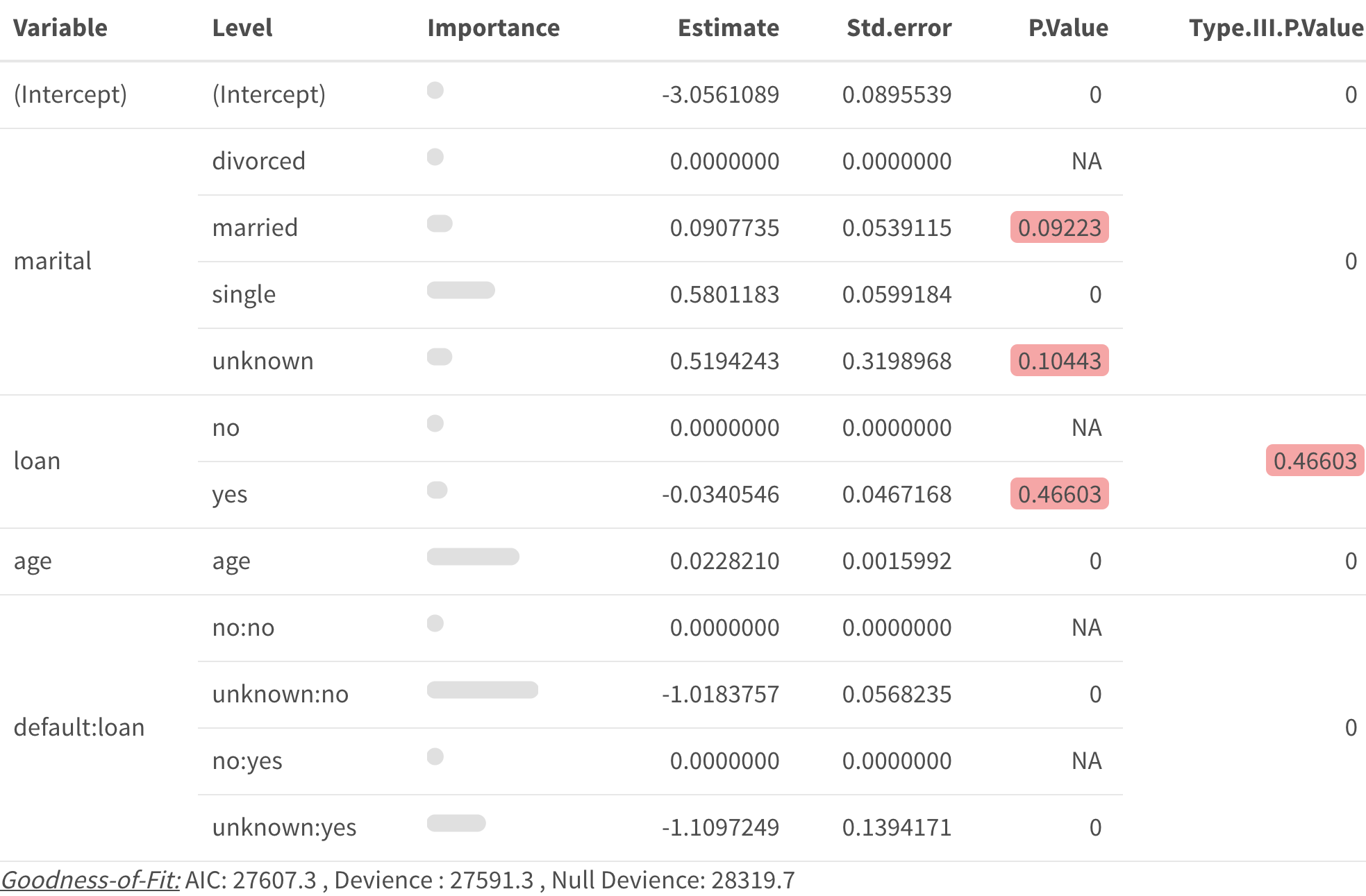
family = binomial)pretty_coefficients()pretty_coefficients() automatically includes
categorical variable base levels.
You can complete a type III test on the coefficients by
specifying a type_iii argument.
You can include a “relativity” column in the output by including
a relativity_transform input. (Note “relativity” is
sometimes referred to as “likelihood” or “odds-ratio”, you can change
the title of this column with the relativity_label
input.)
You can return the data set instead of kable but
setting Return_Data = TRUE
pretty_coefficients(deposit_model, type_iii = 'Wald')
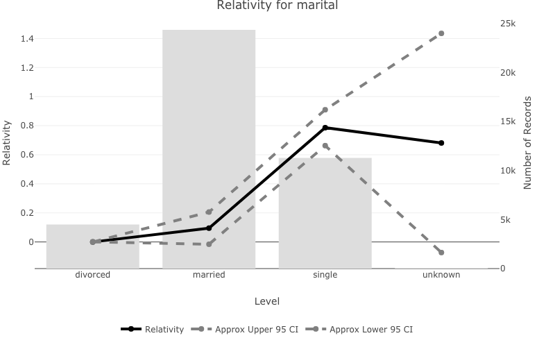
pretty_relativities()pretty_relativities() uses ‘exp(estimate)-1’ which is
useful for GLM’s which use a log or logit link function.pretty_relativities() automatically extracts the
training data from the model object and plots the number of records on
the second y axis.pretty_relativities(feature_to_plot = 'marital',
model_object = deposit_model)
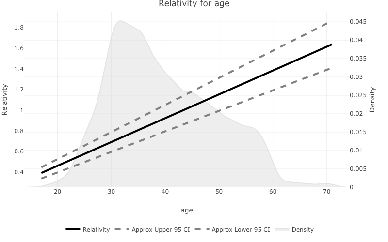
prettyglm will plot the density on a second axis, and
attempt to plot the fit with confidence intervals.pretty_relativities(feature_to_plot = 'age',
model_object = deposit_model)
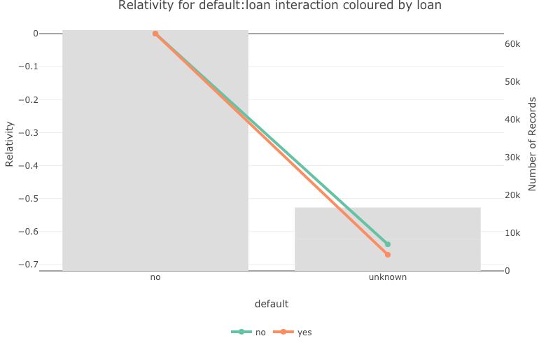
pretty_relativities(feature_to_plot = 'default:loan',
                    model_object = deposit_model,
                    iteractionplottype = 'colour',
                    facetorcolourby = 'loan')
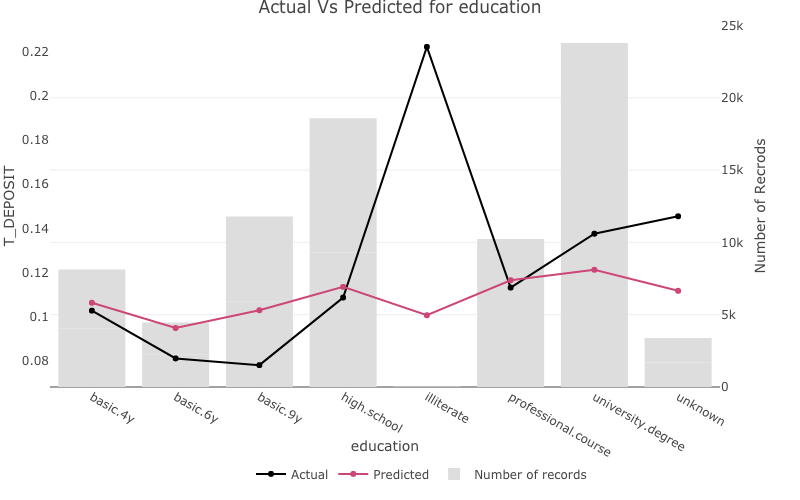
one_way_ave()one_way_ave() creates one-way model performance
plots.
For discrete variables the number of records in each group will be plotted on a second axis.
one_way_ave(feature_to_plot = 'education',
            model_object = deposit_model,
            target_variable = 'T_DEPOSIT',
            data_set = bank_data)
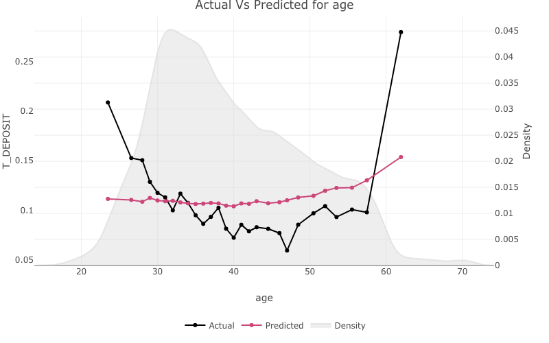
For continuous variables the stats::density() will be
plotted on a second axis.
one_way_ave(feature_to_plot = 'age',
            model_object = deposit_model,
            target_variable = 'T_DEPOSIT',
            data_set = bank_data)
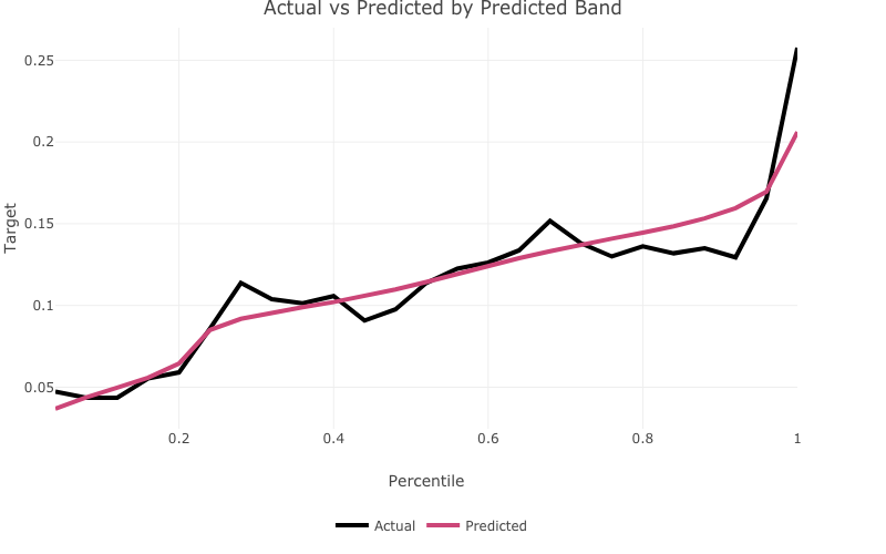
actual_expected_bucketed()actual_expected_bucketed() creates actual vs expected
performance plots by predicted band.
actual_expected_bucketed(target_variable = 'T_DEPOSIT',
                         model_object = deposit_model,
                         data_set = bank_data)

These binaries (installable software) and packages are in development.
They may not be fully stable and should be used with caution. We make no claims about them.
Health stats visible at Monitor.